Dining rooms are where everyday meals turn into meaningful moments. The colours you choose can influence the mood, enhance the space, and even affect how inviting it feels.
Among the most popular trends today are dining room colour combinations that use two shades instead of one. A thoughtfully selected two colour combination for dining room walls can add depth, create contrast, and give your space a refined, designer-inspired look.
In this guide, we explore elegant combinations, practical application ideas, and tips to help you get the most out of your dining room walls.
Why Choose a Two-Tone Colour Scheme for Your Dining Room?
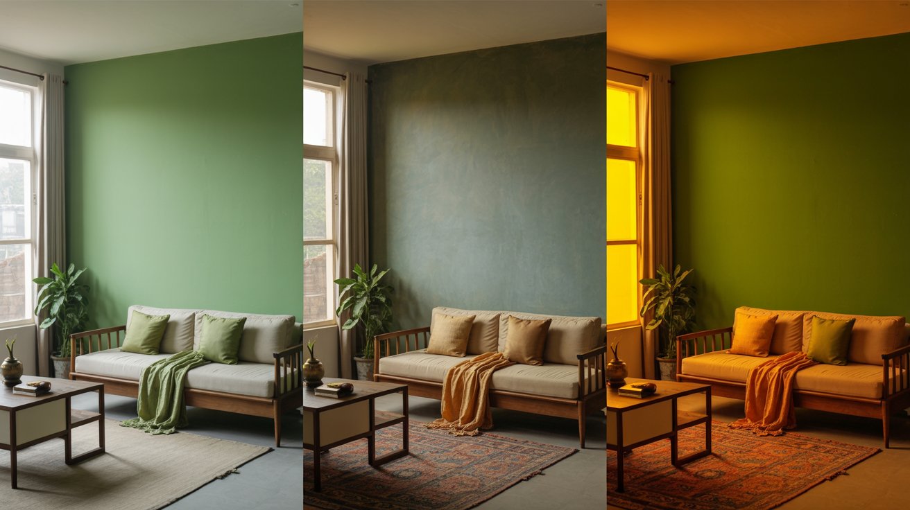
Using two colours instead of one allows you to create visual interest without overwhelming the space.
Well-balanced dining room colour combinations can:
- Add depth and dimension to flat walls
- Highlight architectural features like panelling or mouldings
- Define zones in open-plan layouts
- Create a more structured and polished interior
A carefully chosen two colour combination for dining room walls can make even a compact dining space feel thoughtfully designed.
Elegant Dining Room Colour Combinations to Try
1. Charcoal Grey and Soft Cream
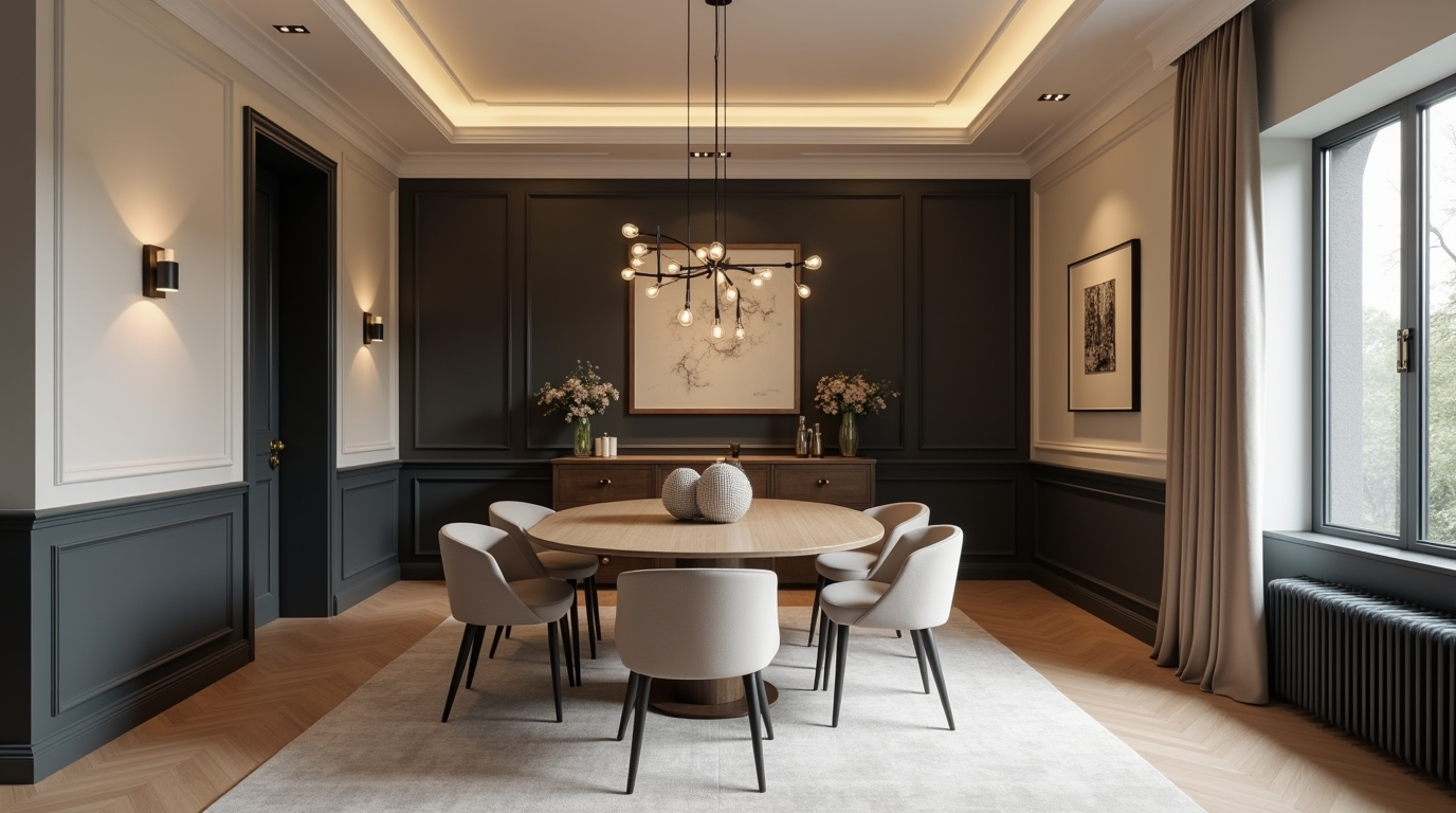
A timeless and sophisticated pairing that works across modern homes.
- Charcoal tone: 5-5-7 Brunette
- Soft cream: 1-1-1 Silk Knot
The richness of the Brunette adds depth, while Silk Knot softens the look and reflects light.
This is one of the most versatile dining room colour combinations for both small and large rooms.
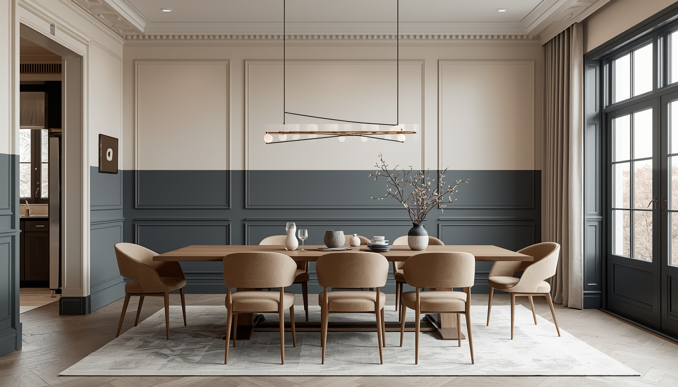
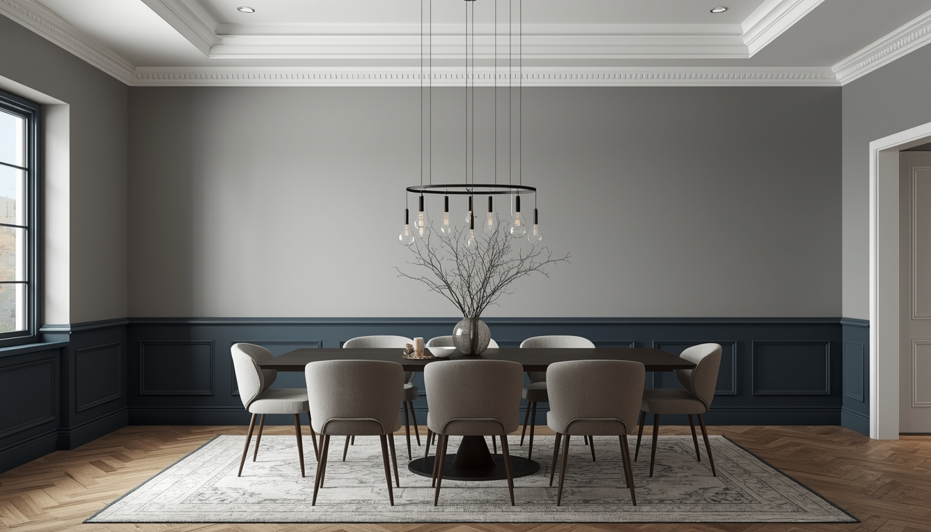
2. Deep Grey-Blue and Warm White
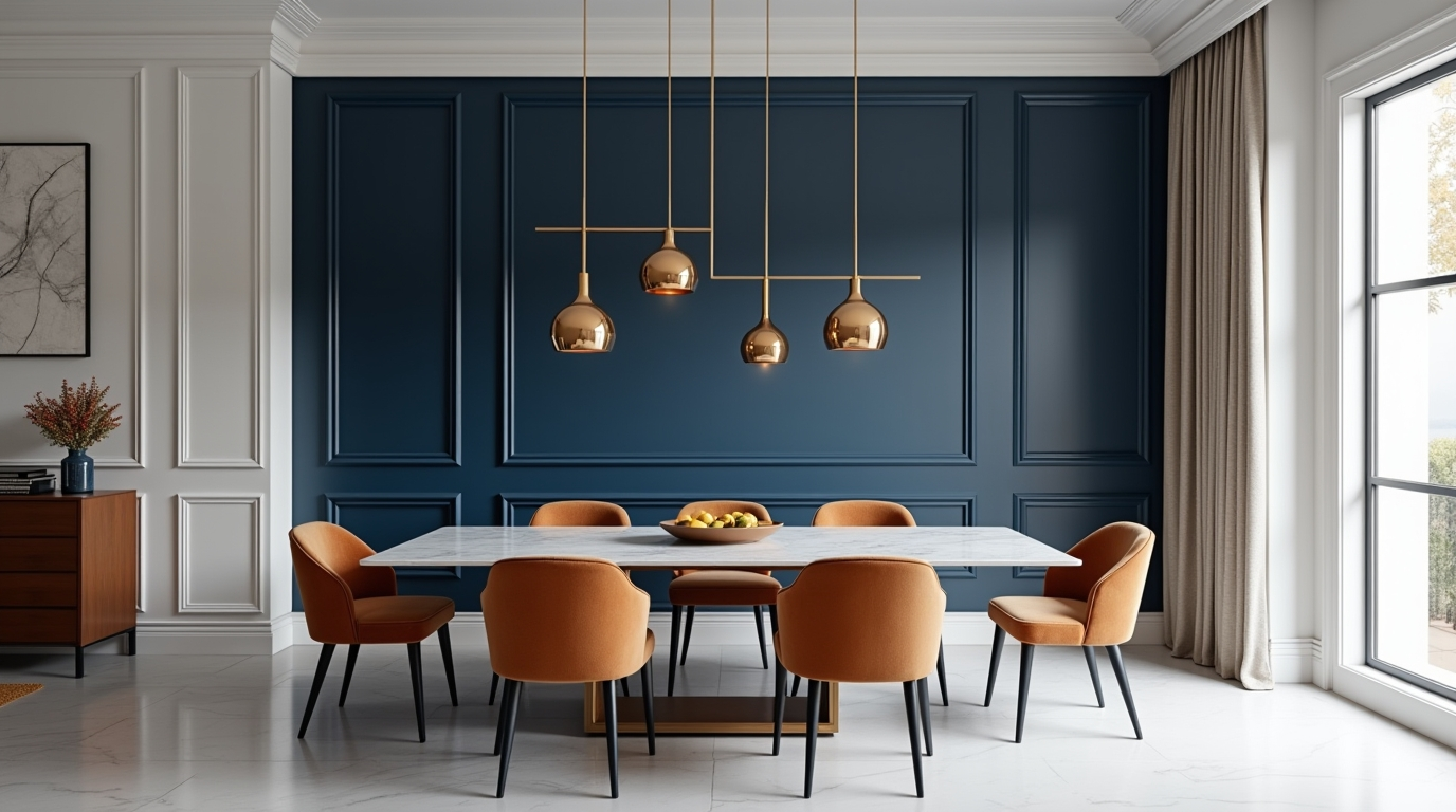
This combination blends boldness with simplicity.
- Deep tone: 5-4-7 Incense Smoke
- Warm white: 3-1-1 Romance
Incense Smoke adds a sense of luxury and formality, while Romance keeps the space bright and open.
A reliable choice if you’re looking for a classic two colour combination for dining room walls.
3. Sage Green and Off-White
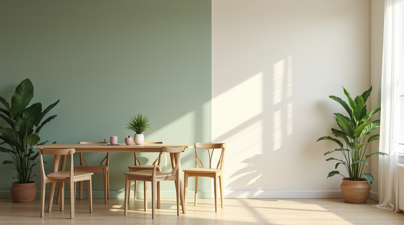
Perfect for a calm and nature-inspired setting.
- Earthy tone: 5-12-3 Matisse
- Off-white: 5-6-1 Rice Paper
Matisse introduces a soothing, grounded feel, while Rice Paper keeps the space light and airy.
Among modern dining room colour combinations, this is ideal for minimalist interiors.
4. Terracotta and Beige
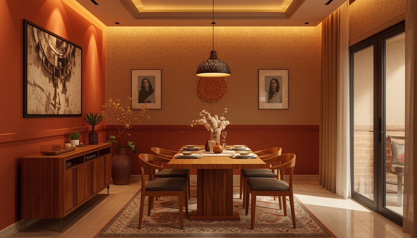
Warm, earthy, and inviting, especially suited for Indian homes.
- Terracotta tone: 2-4-7 Indian Summer
- Beige: 5-2-1 Tapestry Beige
Indian Summer adds richness and warmth, while Tapestry Beige balances the intensity.
This two colour combination for dining room walls creates a cosy and welcoming environment.
5. Dusty Pink and Grey
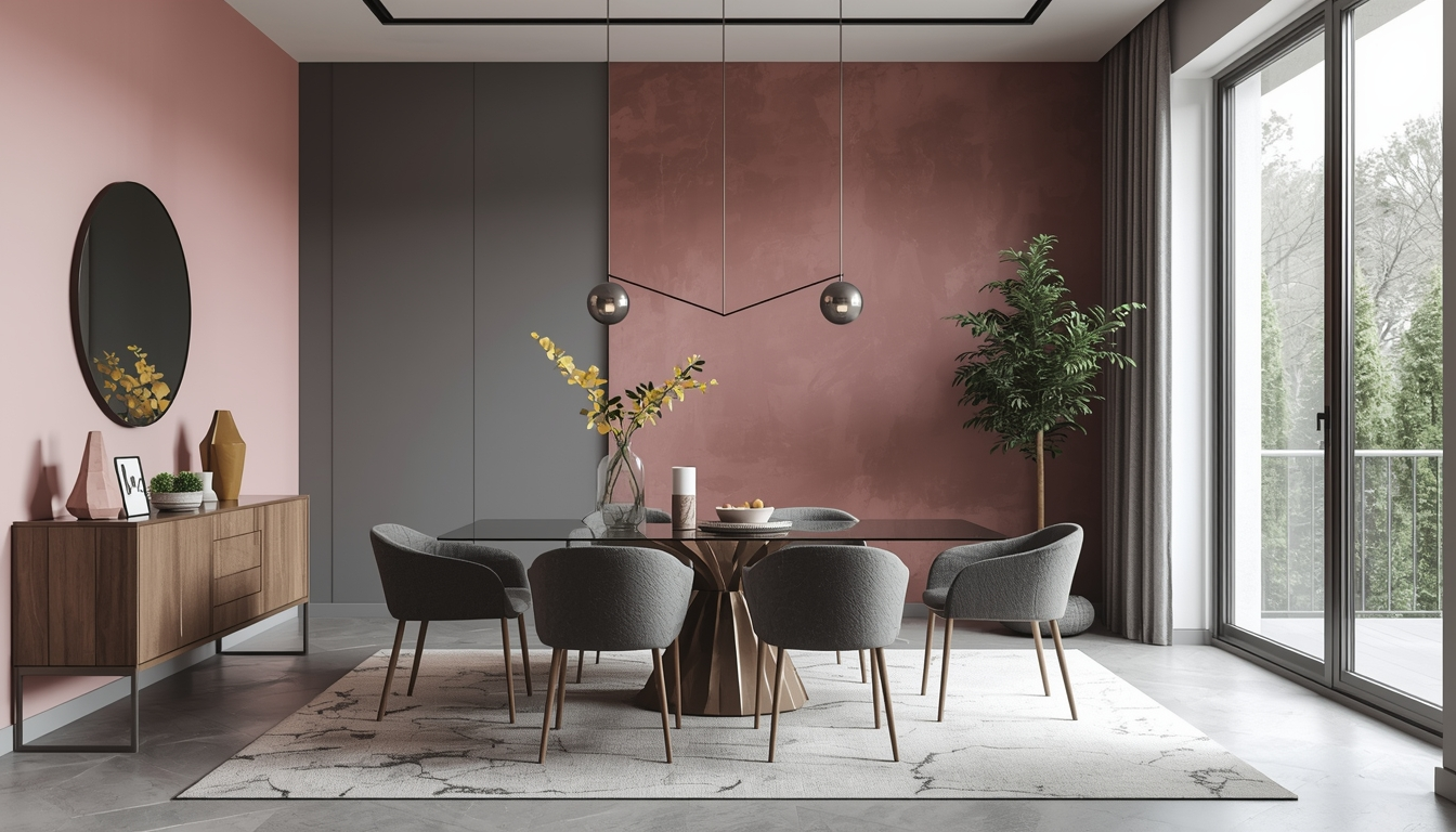
A subtle yet stylish pairing for a refined look.
- Dusty pink: 3-1-4 Pink Dusk
- Grey tone: 5-4-6 Spanish Raisin
Pink Dusk adds warmth without being overpowering, while Spanish Raisin grounds the space with sophistication.
This combination is gaining popularity in contemporary dining room colour combinations.
How to Use Two Colours Effectively in Dining Rooms
1. Horizontal Wall Division
Divide the wall into two sections, typically with a darker shade at the bottom and a lighter one on top.
- Creates visual structure
- Makes ceilings appear higher
- Works well with wall trims or mouldings
2. Accent Wall Approach
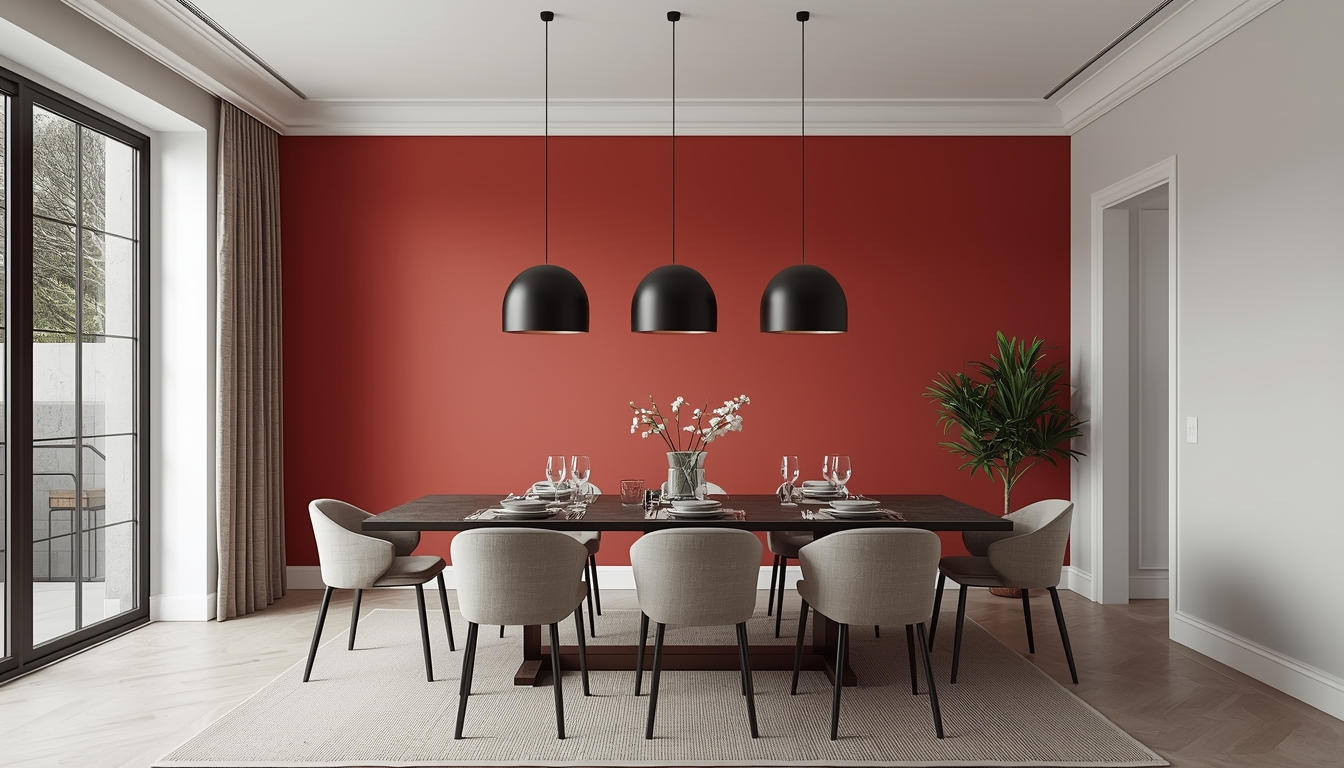
Use one colour on a single wall and a complementary shade for the rest.
- Adds focus without overwhelming the room
- Ideal for smaller dining areas
3. Panel or Section-Based Design
Use two colours within wall panels or geometric sections.
- Adds a premium, designed feel
- Enhances architectural detailing
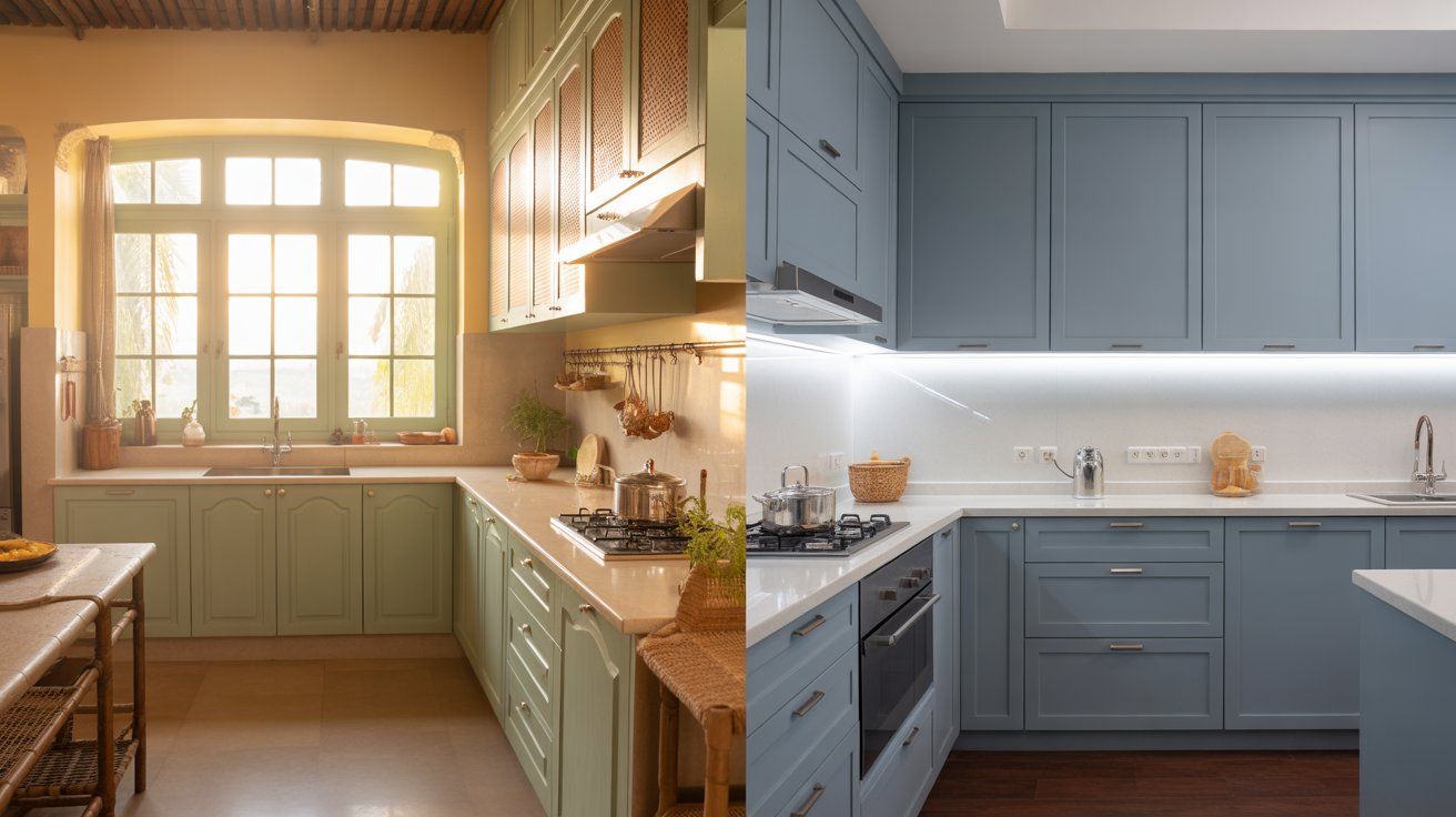
Tips for Choosing the Right Dining Room Colour Combinations
- Focus on contrast: Ensure both colours are distinct enough
- Consider lighting: Darker shades may need additional lighting
- Match with furniture: Coordinate with dining tables and décor
- Test shades first: Colours can look different under lighting
- Keep finishes consistent: Matte for softness, satin for slight sheen
Common Mistakes to Avoid
- Choosing colours that are too similar in tone
- Using overly dark shades in small dining rooms
- Ignoring ceiling colour (lighter ceilings enhance openness)
- Adding too many accent colours
Final Thoughts
The right dining room colour combinations can transform your space from simple to sophisticated. Whether you prefer bold contrasts or softer tones, a well-balanced two colour combination for dining room walls can create a dining area that feels both elegant and inviting.
By focusing on contrast, proportion, and harmony, you can design a dining room that not only looks beautiful but also enhances everyday experiences.