When designing interiors for your home, your ceiling isn’t just a white afterthought — it’s a powerful design surface that can dramatically affect how you perceive space, light, and height. With the right ceiling-wall colour combinations, you can make a room feel taller, brighter or cosier, depending on your goal. This post will walk you through how ceiling colour affects perception (especially in small rooms), then provide actionable pairings and design tips to transform your space.
1. Why ceiling colour matters (and how it affects perception)

What the research says
- A recent study found that brighter ceiling colours (higher luminance) make a room appear higher. In that study, ceilings painted with lighter tones were consistently judged as “higher” than darker ones.
- The same study found little effect of hue (colour family) or saturation (intensity of colour) on perceived height — the brightness of the ceiling was the dominant factor.
- In practical interior design guidance, lighter ceilings reflect more light and tend to make rooms feel more open; darker or warmer ceilings can make a space feel lower, more intimate or enclosed.
How does this apply to small rooms?

If you have a room with limited natural light, low ceilings or compact dimensions, the ceiling-wall colour choices become even more critical. A light, reflective ceiling will bounce light back into the room and help it feel taller. Conversely, making the ceiling significantly darker than the walls may reduce the perceived height and make the room feel more boxed in.
Important takeaways for ceiling + wall design
- Use a lighter or brighter ceiling than the walls if your goal is to maximise height and light.
- If you want to create a cosy, intimate feel in a room with high ceilings, a slightly deeper tone overhead can work — but be mindful not to make the ceiling visually “drop”.
- The transition zone (cornice, edge between wall & ceiling) is important: contrast here or blending here will change how the eye moves and how tall the ceiling feels.
- Ceiling paint finish, lighting and natural light all interplay — a flat finish absorbs more light, a satin finish reflects more. Shadows cast by fixtures or beams will also influence perception.
2. How to pair ceiling colours with your walls – small room friendly combos
Here are several ceiling-wall design strategies with colour pairing ideas, especially mindful of modest spaces and low natural light.
1. White or off-white ceiling + light neutral walls

- A classic “safe” combo: a white (or very pale) ceiling paired with light walls (e.g., off-white, pale grey, soft beige) helps reflect light and keeps the ceiling visually “high”.
- Works especially well in small rooms or rooms with little natural light.
- For example: Ceiling = Ivory White, Walls = Warm Light Grey.
- Tip: Use the same or slightly warmer hue on walls to avoid a stark contrast (which can highlight low ceiling height).
2. Tone-on-tone ceiling slightly lighter than the wall

- Instead of pure white, use a gentle variant of your wall colour on the ceiling — for example, walls in a soft sage green, ceiling in a paler, muted version of that green.
- This subtle contrast keeps visual continuity and helps the eye flow upward—good for compact rooms where you want the ceiling to recede.
- Pairing suggestion: Walls = Dusty Blue, Ceiling = Pale Mist Blue.
- Especially useful when the walls are already a bit darker: lightening the ceiling keeps the openness.
3. Crisp white walls + vibrant ceiling for a dramatic twist
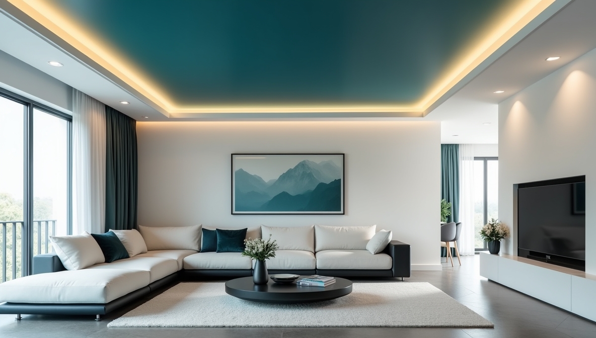
- If you’re after style and have moderate height, try reversed logic: bright white or pale walls and bold colour ceiling.
- A deep teal or rich navy ceiling draws the eye upward and becomes a feature rather than a background. But use cautiously in small rooms: make sure lighting is good and the ceiling colour doesn’t “lower” the space.
- Example: Walls = Bright White, Ceiling = Deep Teal.
- Tip: Use accent décor and lighting focused upward (pendants or uplights) so the ceiling becomes a design statement rather than a “drop”.
4. Darker ceiling for cosy intimacy (only if height allows)

- If your room has ample height (say > 9-10 ft / ~2.8-3 m) and you want a snug or boutique-hotel feel, you can go for a darker ceiling with lighter walls.
- Example: Walls = Warm Light Taupe, Ceiling = Charcoal Grey.
- Tip: Avoid this in low-ceiling rooms or poorly-lit spaces as it may reduce perceived height and absorb light.
5. Matching wall and ceiling (monochromatic envelope)
- Painting walls and ceiling the same colour creates a continuous surface — the eye does not perceive a break at the ceiling line, which can make a space feel more unified and sometimes larger.
- Example: Both walls + ceiling in Soft Warm White.
- Particularly useful in very small rooms or when you have architectural features you want to minimise (e.g., beams, low bulkheads).
- But note: If colour is dark or highly saturated, this envelope effect may shrink the feel of the room, so favour lighter shades.
3. How to weave in “ceiling and wall design” in your strategy
1. Consider the boundary between the wall and the ceiling

The point where the wall meets the ceiling (cornice, cove, moulding, ceiling bulkhead) is a visual break. How you treat that boundary in colour and treatment significantly affects the perceived height and cohesion.
- If you want the ceiling to “disappear” and make the room feel higher, keep the ceiling colour very close to the wall colour (or slightly lighter).
- If you want to highlight the ceiling as a design feature, choose a distinct ceiling colour, and perhaps accent the cornice or bulkhead in a bridging tone.
- Incorporate materials or textures (like wood beams, ceiling planks, or decorative mouldings) as part of the design — these will cast shadows and change how the colour is perceived.
2. Use lighting strategically with paint

The interplay between ceiling and wall design is not only colour but also how light interacts with those surfaces.
- For rooms with little natural light, a ceiling paint with good reflectance combined with uplighting or wall-washer lights can help bounce light off the ceiling.
- In rooms where the ceiling is intentionally darker, use accent lighting to draw the eye upward rather than letting the ceiling recede into darkness.
- Consider the finish: matte ceilings reduce glare and help imperfections disappear; satin or eggshell finishes reflect more light but may show irregularities more.
3. Small room considerations

For compact rooms, keep in mind:
- Use lighter ceiling colours to visually “lift” the room.
- Keep vertical lines clear — avoid heavy cornices or dark ceiling edges that “cap” the space.
- Choose wall colours that enhance light reflection, and avoid too many contrasting trims or crown mouldings that draw the eye horizontally rather than upward.
- When pairing walls and ceilings, maintain harmony — if the ceiling is much lighter than the walls, the effect is height; if much darker, the effect is enclosure. Choose based on your goal.
4. Quick reference table: Ceiling-Wall colour combinations for different effects
| Goal | Ceiling Colour | Wall Colour | Notes |
| Maximise height & light (small room) | Very light/white | Light neutral | High reflectance, minimal contrast |
| Coordinated, elegant look | Slightly lighter tone of wall colour | Mid-tone of that colour | Soft transition upward |
| Statement ceiling & crisp walls | Bold ceiling (e.g., deep teal) | Bright white | Works best when height + lighting are adequate |
| Cosy, intimate feel (high ceiling) | Darker tone overhead | Light/medium walls | Use carefully in tall rooms |
| Unified envelope (minimal break) | Same colour for ceiling & walls | Same colour | Best when the colour is light and the room is small |
5. Final tips for painting ceilings & walls the right way
- Always test paint samples on the ceiling and observe under different lighting (daylight + artificial) — ceilings reflect differently than walls.
- Pay attention to edges and transitions: clean lines at the wall-ceiling junction enhance the effect.
- Use good quality ceiling paint with high light reflectance (LR) if your goal is height/brightness.
- Protect from shadows: avoid heavy beams or large light fixtures casting dark shadows that reduce the perception of height.
- If ceilings are low (say less than ~2.4 m), avoid heavy patterns or dark beams overhead — lean light, flat finishes.
- In rental or multi-use spaces, you can also experiment with lighten-the-ceiling by using very pale pastel overhead — such as a hint of sky-blue, blush or pastel green, which still reflects light but adds subtle character.
6. Conclusion
Your ceiling is far more than just a “white blank” above you — it is a key surface in what we’d call “ceiling and wall design”. With thoughtful combinations of ceiling colour and wall colour, you can significantly alter how a room feels: making it open, tall, bright, or cosy and intimate depending on your need.
For a small room with limited height or light, favour a light, reflective ceiling and moderately light walls. If you’re in a larger, well-lit room, you can play with statement ceilings, tone-on-tone transitions or even darker overheads for mood.
By keeping both aesthetics and perception in mind, you’ll make much better choices when picking ceiling-wall paint combinations, resulting in rooms that don’t just look nice — they feel right.


