There is a common interior design rule that says everything in a room should belong to the same colour temperature, warm walls with warm furniture, cool walls with cool furniture. While this approach feels safe, it often creates spaces that look flat and predictable.
The rooms that feel memorable usually rely on contrast instead of perfect matching. One of the most effective ways to create that contrast is by pairing warm wall colours with cool-toned furniture.
This combination works because each element enhances the other. Warm walls make cool furniture look sharper and more intentional, while cool furniture prevents warm colours from feeling heavy or overwhelming. Instead of competing, the two temperatures create balance, depth, and visual energy.
Why Warm and Cool Contrast Works
A room designed entirely in warm tones can sometimes feel visually heavy. On the other hand, spaces filled only with cool greys and whites may feel cold or impersonal.
Combining the two creates movement for the eye. Warm colours naturally feel softer and more welcoming, while cool furniture introduces structure and clarity. This balance helps the room feel layered and thoughtfully designed instead of overly coordinated.
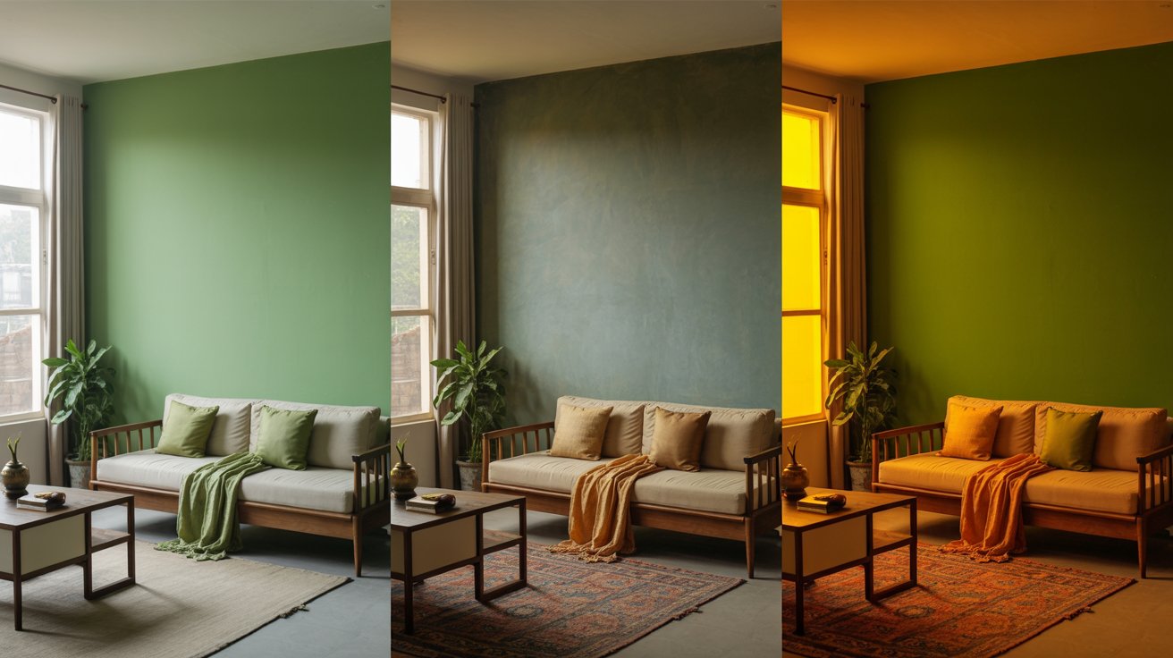
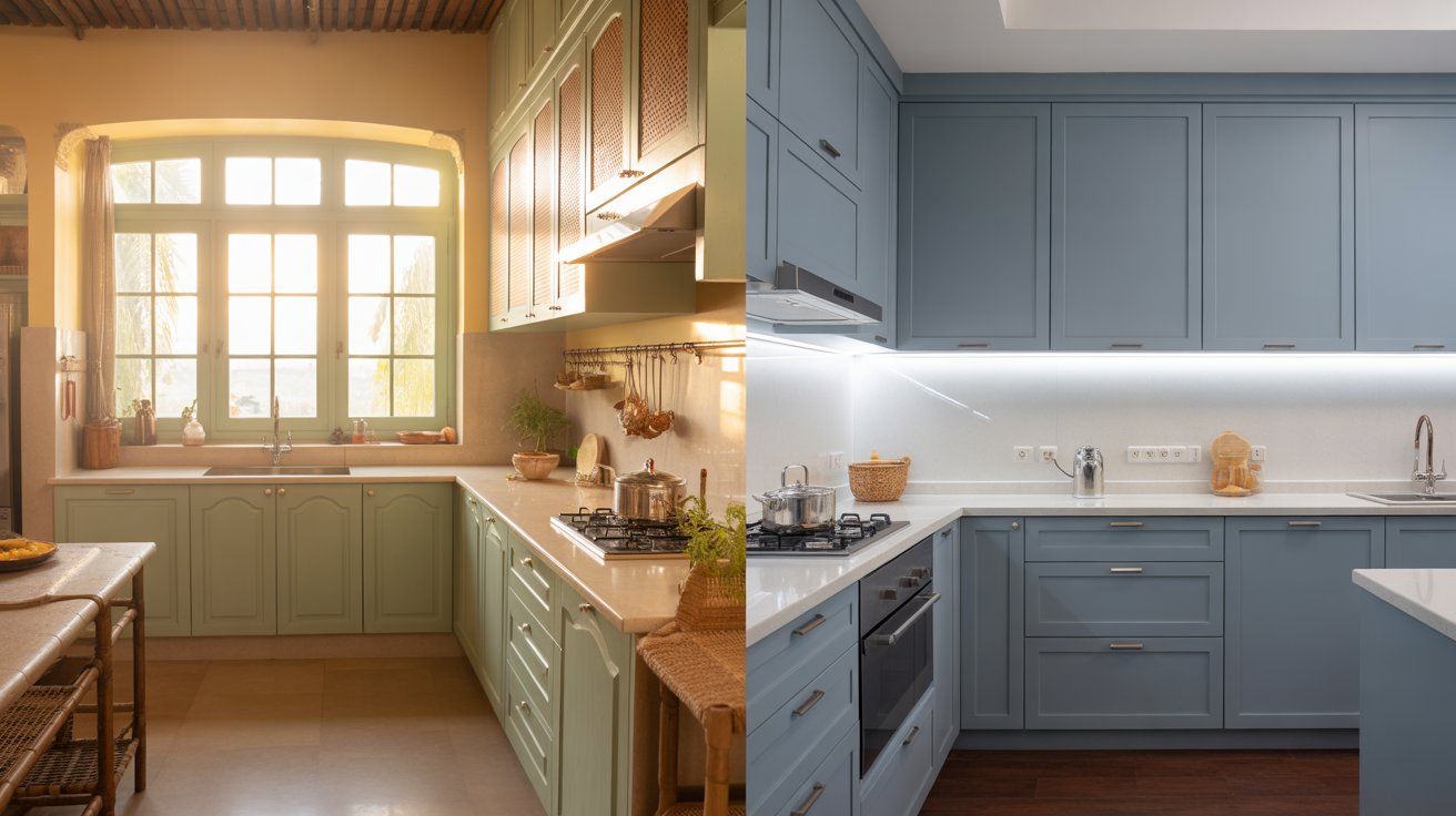
Another reason this pairing works so well is that contrast creates the illusion of richer lighting. Warm walls reflect a glow similar to late-afternoon sunlight, while cool-toned furniture adds crispness and definition. Together, they make interiors feel more dynamic throughout the day.
Warm Wall and Cool Furniture Pairings That Work
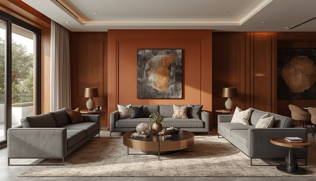
Terracotta Walls + Slate Grey Furniture
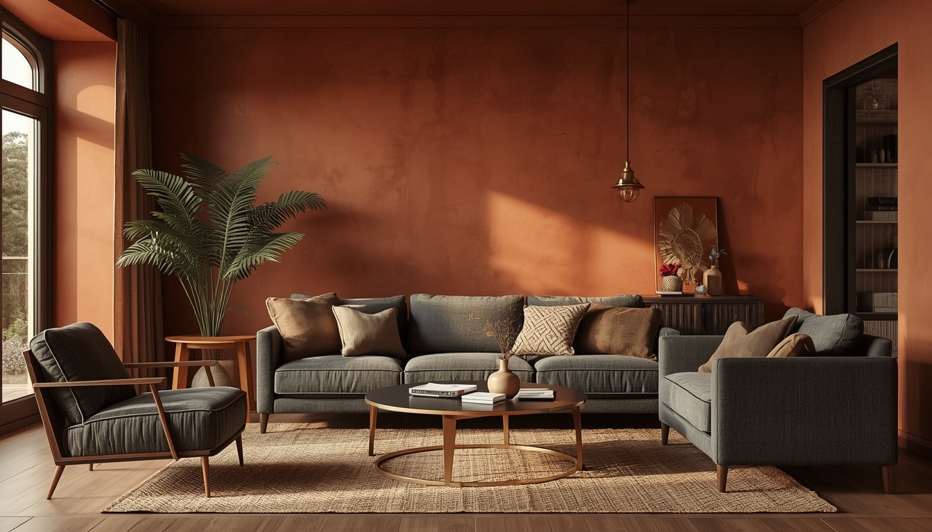
Warm terracotta walls paired with slate grey furniture create one of the most timeless warm-cool combinations. The earthy warmth of terracotta makes grey sofas or chairs feel more sophisticated and intentional, while the grey tones prevent the walls from becoming visually overpowering.
This pairing works especially well in living rooms and open-plan spaces.
Good additions include:
- Linen cushions
- Brass accents
- Wooden textures
- Jute rugs
Soft Peach Walls + Charcoal Furniture
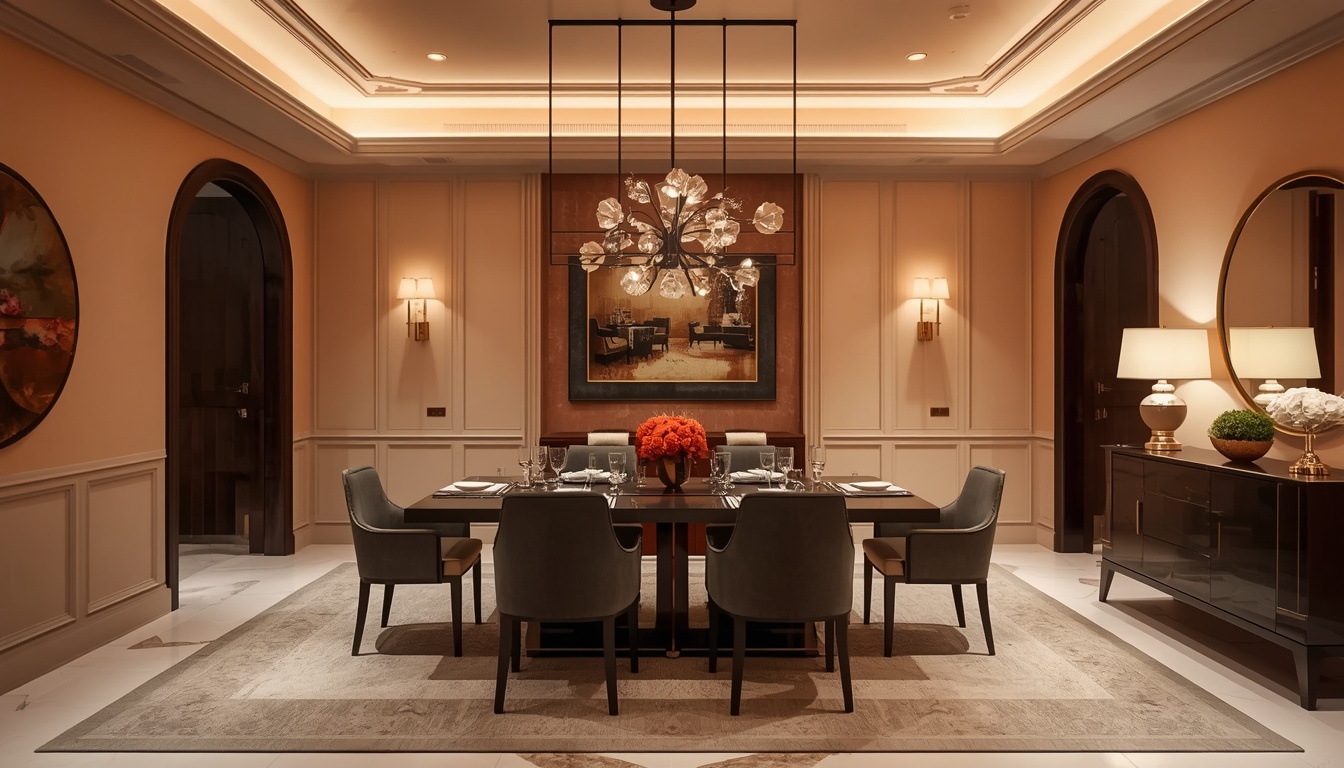
Soft peach walls are often underestimated because they appear subtle in paint swatches. However, when combined with charcoal or gunmetal furniture, they create a warm yet modern atmosphere.
The peach softens the darkness of the furniture, while the charcoal tones add depth and contrast. This combination works beautifully in dining rooms, where warm walls create a welcoming mood and darker furniture adds elegance.
Coral Walls + Dusty Blue Furniture
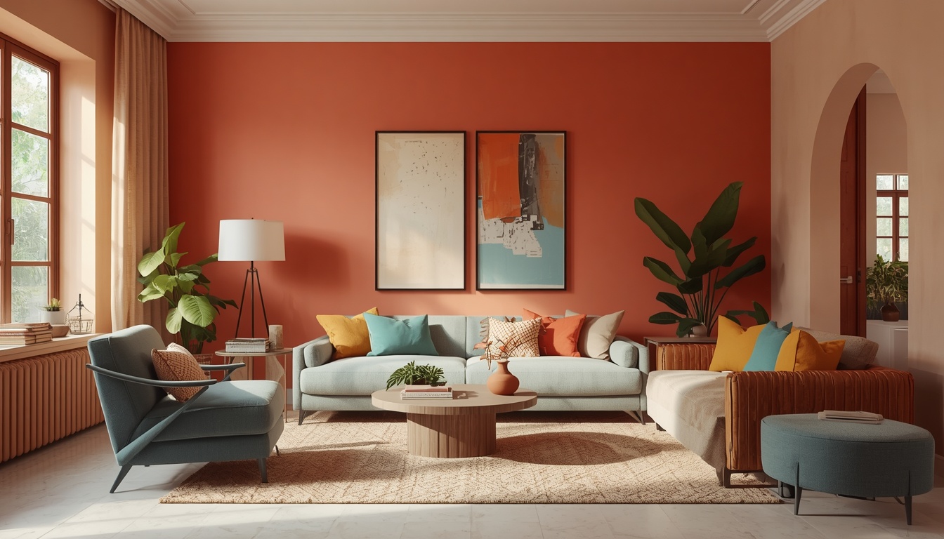
Warm coral walls paired with dusty or muted blue furniture create a balanced contrast because the colours sit opposite each other on the colour wheel.
The coral introduces energy and warmth, while the blue tones calm the space and prevent it from feeling too bright. This pairing works especially well in creative spaces, living rooms, or children’s rooms where homeowners want colour without chaos.
Mustard Walls + Concrete Grey Furniture
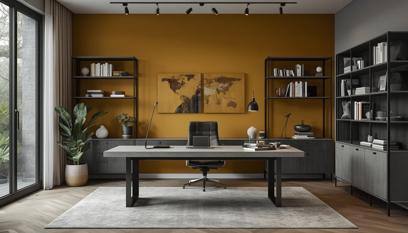
Deep mustard or ochre walls paired with cool concrete-grey furniture create a sophisticated, modern contrast. The industrial coolness of grey balances the richness of mustard, resulting in a room that feels warm but still contemporary.
This combination works particularly well in:
- Home offices
- Dining areas
- Modern apartments
- Open-plan interiors
Sandy Beige Walls + Navy Furniture
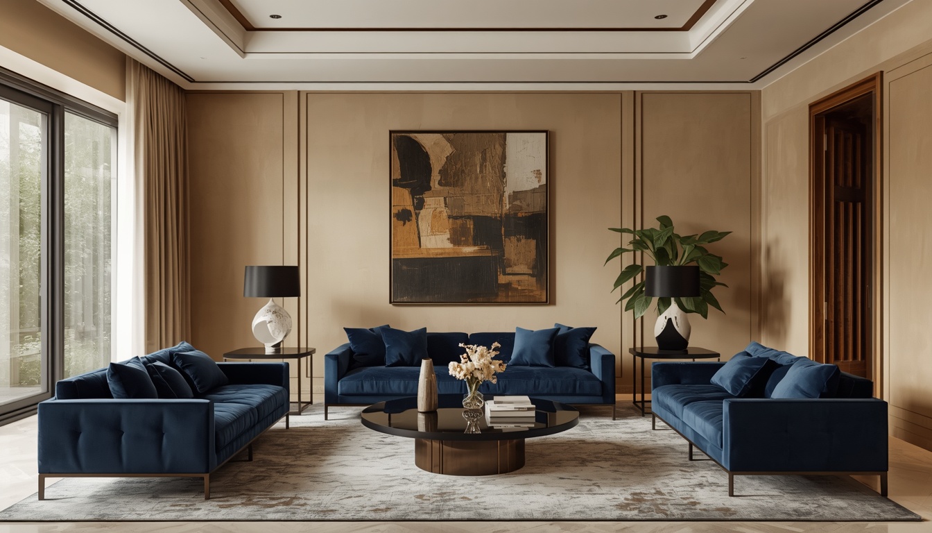
This is one of the easiest warm-cool combinations to use in Indian homes. Warm sandy beige walls paired with navy or midnight blue furniture create a space that feels calm, elegant, and timeless.
The navy furniture stands out more strongly against the warmth of the walls, while the beige tones feel richer and softer beside the deep blue.
This pairing works well for homeowners who want contrast without overly bold colours.
Pairings That Usually Do Not Work
Not every warm-cool combination creates harmony. Some pairings feel visually confusing because the undertones clash rather than balance each other.
For example:
- Warm yellow-green walls with cool blue-green furniture can look muddy
- Very pale warm walls with very pale cool furniture may feel washed out
- Bright orange walls with cool purple furniture often feel overly theatrical
The key is contrast with control. Successful pairings create visual balance rather than competition.
How to Make Warm-Cool Pairings Feel Balanced
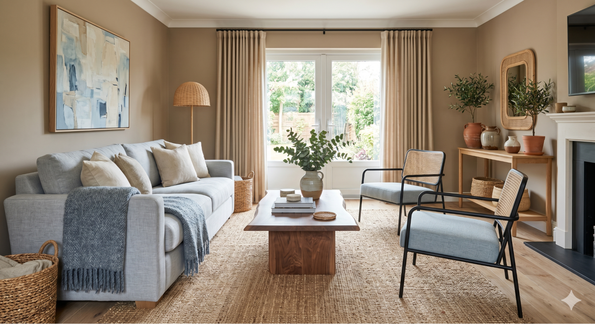
Use Natural Materials
Bridging materials help connect warm and cool tones naturally.
Examples include:
- Wooden furniture
- Rattan textures
- Linen fabrics
- Jute rugs
- Ceramic décor
These elements soften the contrast and make the room feel cohesive.
Let One Temperature Lead
The most successful interiors usually have a dominant temperature.
For example:
- Warm walls + cool furniture
or - Cool walls + warm furniture
Trying to divide the room equally between warm and cool tones can make the space feel visually confusing.
Match the Intensity
A deeply saturated wall colour works best with furniture that has similar visual depth. Extremely bold walls with very pale furniture can feel unbalanced unless softened with textures and accessories.
Room-by-Room Approach
Living Room
Warm terracotta, coral, or dusty rose walls paired with slate grey or steel blue sofas create inviting yet sophisticated living spaces.
Bedroom
Bedrooms benefit from softer contrast. Warm beige or blush walls with cool white or pale grey bedding create a calm and relaxing atmosphere.
Dining Room
Dining rooms can handle stronger contrast. Warm walls paired with charcoal or navy dining chairs create a space that feels dramatic and welcoming at the same time.
Home Office
Warm mustard or terracotta walls combined with cool grey desks or shelving help create spaces that feel energetic yet focused.
Final Thoughts
The idea that warm and cool tones should never mix is one of the biggest misconceptions in interior design. In reality, thoughtful contrast is what gives a room depth, character, and visual balance.
Warm paint colours make cool-toned furniture feel more refined and intentional, while cool furniture prevents warm walls from becoming overwhelming. Together, they create interiors that feel layered, dynamic, and thoughtfully designed rather than overly coordinated.
When balanced correctly, warm and cool combinations can completely transform how a room feels. Thoughtfully selected shades from brands like Indigo Paints can help homeowners experiment with these pairings and create interiors that feel both visually striking and comfortable to live in every day.