When planning your dream home, selecting the right paint colours is more than just picking a shade you like, it’s about setting the right mood and enhancing the aesthetic of your space. Understanding the difference between warm and cool tones is essential in creating a balanced and inviting atmosphere that reflects your personality and purpose for each room.
What Are Warm and Cool Tones?

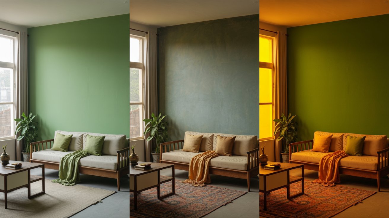
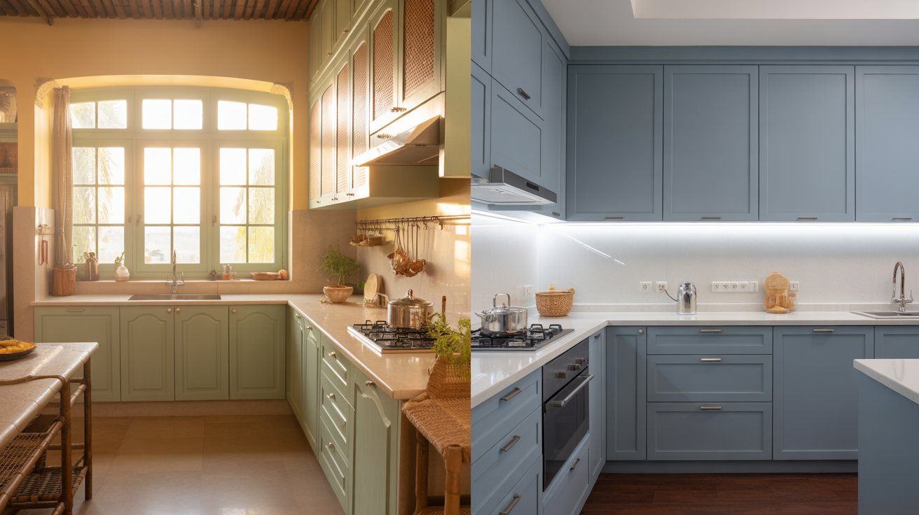
Warm tones include colours like red, orange, yellow, and variations of these shades. These colours tend to energise a room and are often used in living areas and kitchens to create a cosy, welcoming feel.
Cool tones, such as blue, green, and purple, offer a calming and soothing effect, making them ideal for bedrooms, bathrooms, and study areas where relaxation and focus are key.
How to Choose the Right Colour Combinations
Before diving into your paint selection, refer to a comprehensive colour selection guide to understand how different tones interact. Here are a few popular approaches:
1. Monochromatic Palette

Stick to different shades of the same hue for a clean and cohesive look. For instance, using various cool blues in a bedroom creates serenity while keeping the space visually engaging.
2. Contrasting Colours

Using warm and cool colours together can add dramatic flair. Think of a soft cream wall with a deep navy accent or a terracotta feature wall against pale grey surroundings, perfect for accent walls or two-tone walls in living spaces.
3. Neutral Colour Palette

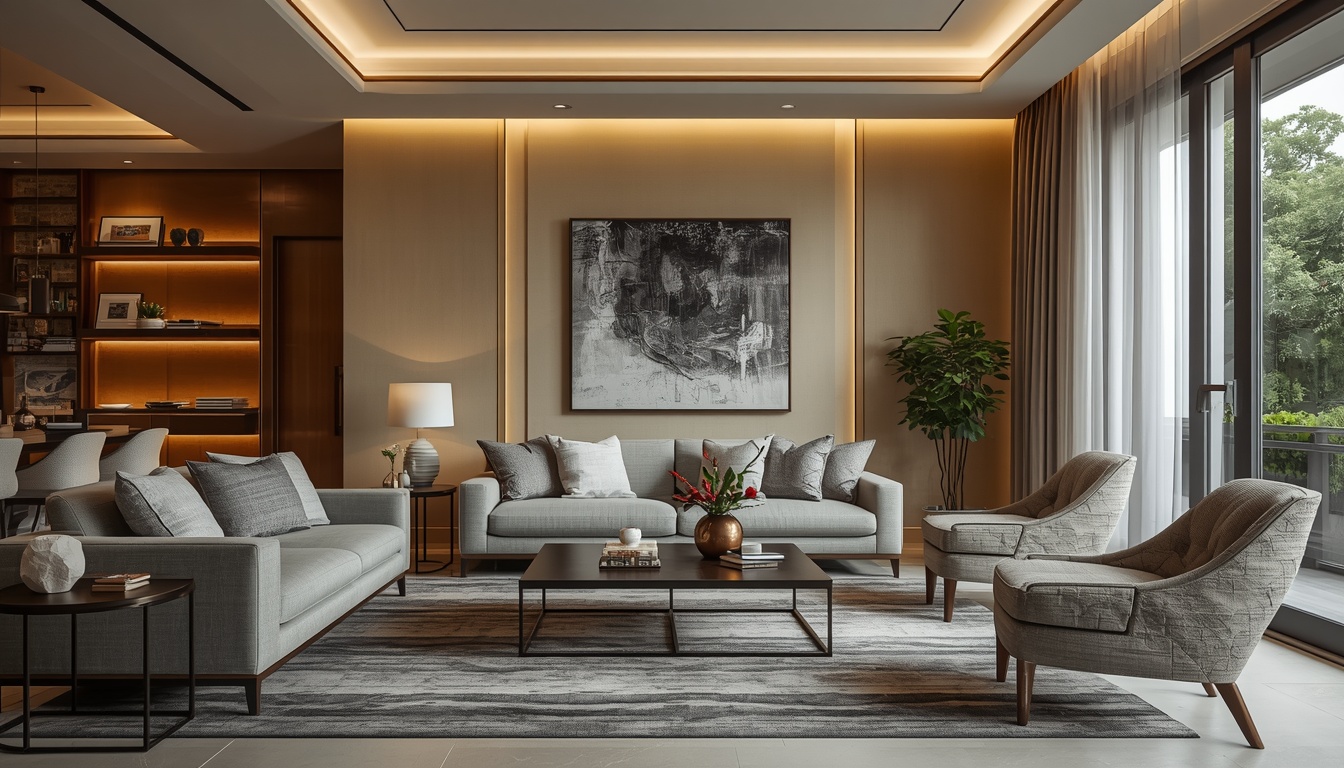
Not sure which way to go? Neutrals like beige, ivory, and taupe bridge the gap between warm and cool. These tones work beautifully with bold or pastel highlights and are ideal for an understated yet sophisticated vibe.
Room-by-Room Colour Inspiration
Living Room Design

Choose warm shades like muted oranges or soft yellows to foster connection and energy. If you prefer cool tones, opt for teal or slate blue for a modern touch. Explore products from the Premium Interior Emulsion to get that perfect living room look.
Bedroom Paint Ideas

Bedrooms benefit from soothing cool hues like lavender or mint green. These promote restfulness and balance. For a luxurious finish, consider the Luxury Interior Emulsion
Playful Pastel Shades for Kids’ Rooms

Pastels like peach, mint, and lilac create cheerful and inspiring spaces for children without being overpowering. Pair with gentle wall textures or stencil patterns for extra charm.
Understanding Paint Types and Finishes

The choice of paint finishes impacts both the look and maintenance of your walls. Matte finishes are great for concealing imperfections, while satin and sheen finishes offer a subtle glow, ideal for interior paint colours in high-traffic areas. For added elegance, the Premium Interior Sheen Emulsion is worth exploring.
Warm vs. Cool Tones for Exteriors

While exterior paint colours must withstand environmental factors, the tone still plays a big role. Warm earth tones blend well with Indian landscapes, while cool tones like greys and blues add a modern touch to exteriors. Balance is key; aim for harmony with the surrounding architecture and landscape.
Final Thoughts

Choosing between warm and cool tones isn’t about right or wrong, it’s about the feeling you want to create in your home. Consider the room’s function, natural light, and your personal style. Use a blend of tones to create depth and character. For more tips and ideas, explore our complete home painting guide.
Whether you want a vibrant living room, a peaceful bedroom, or a standout feature wall, the right colour combinations and paint types can make all the difference. Happy painting!