
Choosing the right interior colour combination isn’t just about making your home look good in a particular season. It’s about creating a space that feels fresh, inviting, and stylish every single day of the year. Whether it’s the humid monsoon, chilly winter, or bright summer, the colours you choose for your interiors set the tone for your comfort and mood.
In this blog, we’ll explore timeless home colour combinations that look beautiful all year round, and give you practical tips to make them work for your space.
What Makes a Colour Combination Timeless?
When choosing colours for your interiors, the goal is balance. A timeless colour scheme adapts well to different lighting conditions, seasons, and interior decor styles. The best interior colour combination feels warm during winters, refreshing during summers, and effortlessly fits with your furniture and accessories.
Here’s what to consider:
- Natural lighting: Choose lighter shades for darker rooms and richer hues for sunlit spaces.
- Room function: Bedrooms may benefit from calming colours, while living rooms can embrace more vibrant tones.
- Colour psychology: Certain colours evoke specific emotions. Greens relax, blues calm, and neutrals provide balance.
Top Year-Round Interior Colour Combinations for Indian Homes
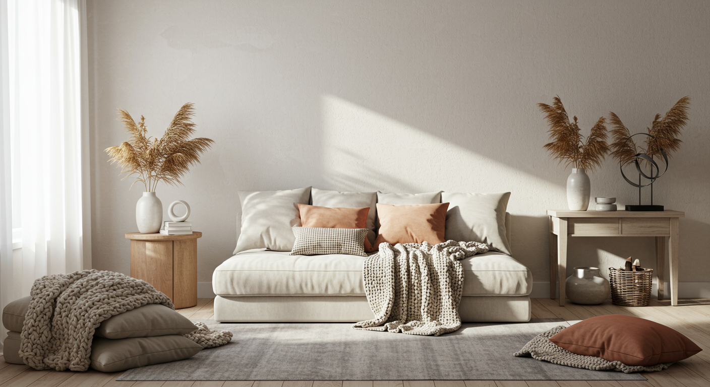
1. Beige and Soft White – The Classic Neutral Pair

This combination brings warmth and simplicity into any room. It works especially well in living rooms or open areas where you want a cosy yet clean vibe. Beige adds subtle warmth while white reflects light, keeping the space bright throughout the year.
2. Muted Sage and Cream – Nature-Inspired Calm
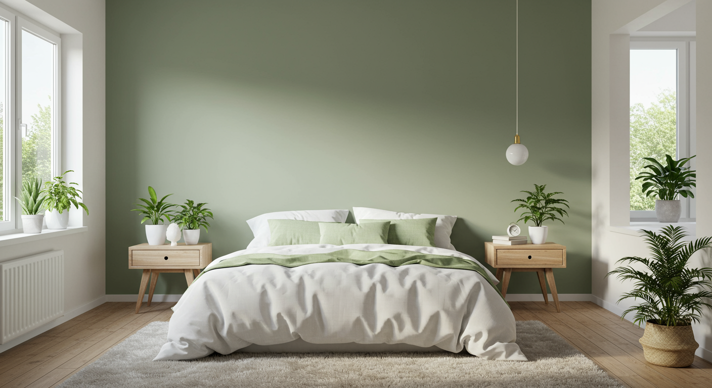
Muted sage or Green Myth (2-18-2 from Indigo fandeck), a dusty green shade, pairs beautifully with off-white or cream walls. It evokes the freshness of spring and the grounded feel of nature. Ideal for study rooms or bedrooms, this pair feels modern yet rooted.
3. Charcoal Grey and Sky Blue – Balanced and Breezy
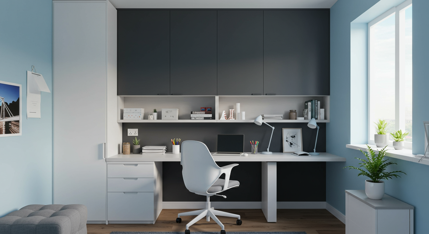
This contrast between bold and soft makes a stylish statement. Use charcoal as an accent wall and sky blue for the rest to maintain brightness. It’s perfect for bedrooms or workspaces where focus and serenity are both needed.
4. Terracotta and Off-White – Warm Meets Airy
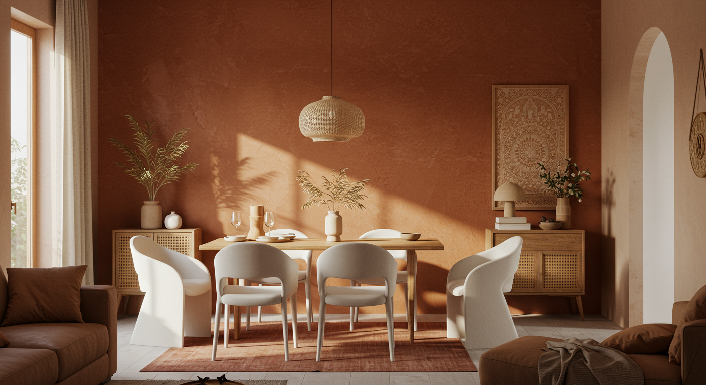
A nod to traditional Indian aesthetics, terracotta brings richness and energy. Off-white balances its warmth and keeps it from feeling too heavy. Ideal for dining rooms or hallways, this combination shines in natural light.
5. Dusty Rose and Taupe – Subtle and Sophisticated
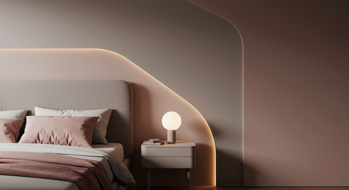
For those who prefer an understated elegance, dusty rose or Rambling Rose(4-2-4 from Indigo fandeck) with taupe offers a gentle palette that’s never overpowering. These shades work well in guest rooms, dressing areas, or modern, minimalistic homes.
How to Choose the Right Combination for Your Home

Before you commit to any colour scheme, keep these tips in mind:
- Observe the natural light: North-facing rooms may need warmer tones, while south-facing ones can take cooler shades.
- Think long-term: Choose colours you won’t get tired of in a few months.
- Sample first: Always test paint swatches on a small wall section to see how they look in different lighting conditions.
Looking for durable, high-quality wall finishes to match these combinations? Explore a wide range of interior emulsions that offer smooth finishes and long-lasting vibrancy.
Tips to Keep Your Wall Colours Looking Fresh Year-Round
- Use high-quality emulsions to resist dampness, fading, and peeling.
- Regular dusting and spot-cleaning can preserve brightness, especially in high-traffic areas.
- Ventilation matters, proper airflow prevents damp spots and keeps colours crisp.
Conclusion: Choose Colours That Reflect Your Personality, Not Just the Season

Your home should tell your story, and colour is one of the most powerful tools to do that. Instead of chasing seasonal trends, invest in home colour combinations that resonate with your style and last through every season.
With the right interior colour combination and the perfect paint finish, your home can look beautiful, feel comfortable, and stay timeless, all year round.
FAQ
Which interior colour combination is best for all seasons?
Neutral shades like beige and white, or nature-inspired tones like sage and cream, are great for all seasons. They balance warmth and brightness, making your space look fresh year-round.
How do I choose the right home colour combination for my interiors?
Consider the direction of natural light, the room’s purpose, and your personal preferences. Warm colours suit dimly lit rooms, while cool tones work well in sunlit areas.
What colours make a small room look bigger?
Light shades like off-white, soft blue, or pastel combinations reflect more light and make smaller spaces appear larger and airier.
Can I use dark colours as part of my home interior colour combination?
Yes, but use them as accents. Pair darker colours like charcoal or terracotta with lighter shades to maintain balance and avoid a cramped look.
What is the best paint type for interior walls?
Interior emulsions are highly recommended. They offer smooth finishes, resist stains, and maintain colour freshness throughout the year. You can explore options here.


