When it comes to designing commercial spaces, colours do more than just beautify walls; they shape perception, influence mood, and boost productivity. The right office colour combinations can inspire confidence, enhance focus, and elevate the overall office ambience. In this blog, we explore the most powerful colour duos, rooted in colour psychology, that can transform your workspace into a hub of creativity, positivity, and professionalism.
1. Blue and White: The Duo of Focus and Clarity

Blue for calmness, blue for focus, it’s no surprise this colour is a top choice for modern commercial interiors. When paired with crisp white, this combo evokes a sense of clarity and discipline. Ideal for boardrooms or executive cabins, this duo enhances concentration and supports decision-making.
Tip: Add this to your accent wall ideas for a clean, professional look. And if you’re looking to revamp with quality finishes, explore Indigo Paints’ Interior Emulsions for smooth and lasting wall colour options which come in a variety of shades. Refer to our fandeck for shades like Blue Heaven (1-32-4), Cloud Nine (1-32-1) and Floating Petals (15-51-5) to get such beautiful combinations
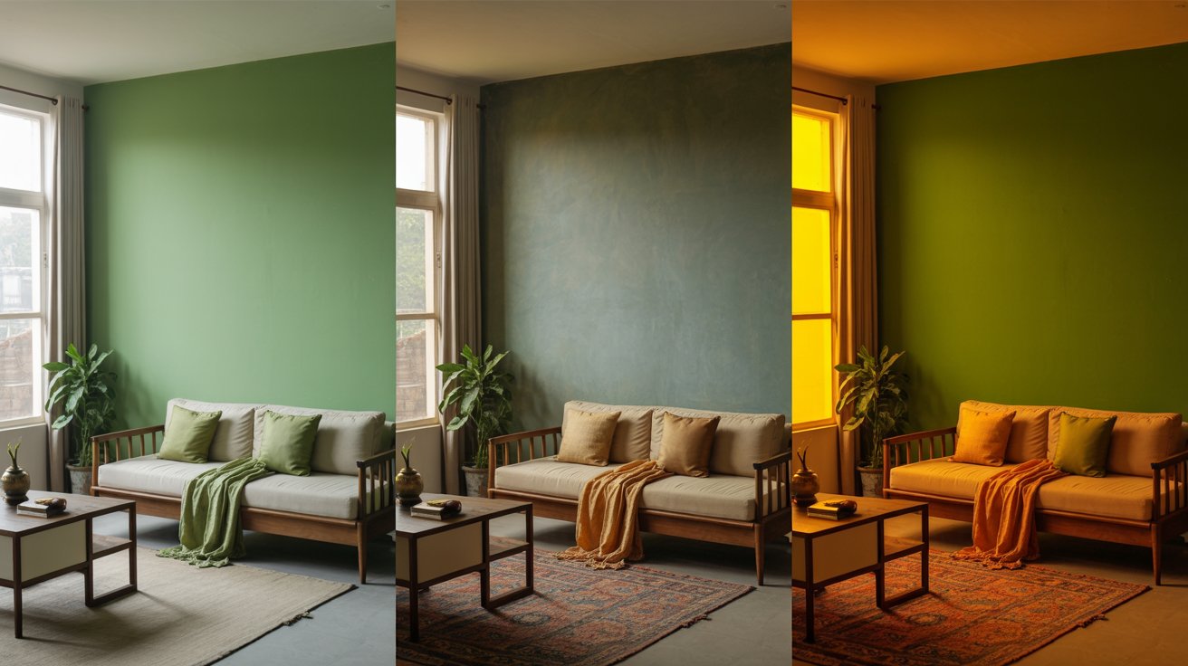
2. Green and Grey: Balance Meets Sophistication

Green for focus and green for relaxation make it a dual-purpose wonder. Combine it with neutral grey to add a contemporary, calming touch to your professional workspace colours. This duo is perfect for brainstorming rooms or breakout areas where employee morale and colour go hand in hand. Whether it’s light green for calmness or a deeper olive tone for rustic vibes, it seamlessly supports workspace colour trends with a grounding effect.
3. Yellow and Beige: Optimism in Neutral Territory

Yellow for optimism and energy can feel overpowering alone, but when blended with warm beige, it brings just the right amount of sunshine. This is a top pick for reception zones and collaborative lounges, promoting positivity without distracting from the task at hand.
This pairing fits beautifully into both home office paint colours and commercial zones, reflecting a balance between cheerfulness and professionalism.
Use shades such as Electric Yellow (1-15-7), Marsh Gold (2-15-4) from the Indigo Paints Fandeck to give your home an energetic look
4. Red and Charcoal: Bold and Grounded

Red for energy, passion, and motivation meets the calm authority of charcoal. This high-contrast pairing works wonders in creative workspace colours, where ideation and action are constant. A great fit for design studios, this duo enhances office aesthetics while anchoring creative energy.
Use red as an accent wall to avoid visual fatigue, and let charcoal ground the rest of the space. Shades such as Delectable (1-1-7), Signorina (1-3-7) and Obelisk (5-15-7) will fit the theme well
5. Pastel Blue and Taupe: Soft Meets Sophisticated

For home office decor colours or calm meeting areas, this pastel pair offers serenity with a touch of class. Light blue for creativity is ideal for sparking ideas without overstimulating. Taupe adds earthy warmth, making this a favourite among calming office colours and focus-enhancing colours.
It also resonates well with Vastu colours, believed to support mental clarity and peace.
6. Terracotta and Cream: Rustic Warmth in the Modern Age

Rustic warmth is making a strong comeback in office colour schemes. Terracotta, an earthy, reddish-orange- brings warmth and grounded energy, while cream softens the look, creating a welcoming and inclusive environment. Together, they boost both style and employee morale.
This is a great example of fusion colour combinations that blend tradition and trend for unique, inspiring office designs.
Colour Combinations That Go Beyond Looks

While aesthetics matter, productivity and colour, lighting and colour, and emotional response should drive design decisions. From bold office colours to monochrome schemes, the right mix creates a sense of purpose and place.
Your office branding colours should also align with your business values. Whether you need professional home office colours or lively creative office colours, these duos serve function and form.
To achieve the perfect finish, don’t forget to check out Indigo Paints’ Interior Emulsions, crafted to bring your vision to life with superior coverage and durability.
Refer to the Indigo Fandeck and find a variety of shades for your home
Final Thoughts
Choosing the right colours isn’t just about trends, it’s about building an environment where people feel confident, focused, and inspired. With the perfect colour duos, your workspace becomes more than a location, it becomes a catalyst for creativity and success.