Orange is one of the most energetic colours in interior design. Warm, expressive and full of personality, it can instantly uplift a room, but when used incorrectly, it can also feel overpowering. Understanding the meaning of the orange colour and learning how to use it in a balanced way helps you enjoy its vibrancy without visual fatigue.
This guide explains what orange represents, how it influences mood, and practical ways to use orange in modern interiors without overwhelming your space.
What Does the Colour Orange Mean in Interiors?

Orange is a blend of red’s energy and yellow’s optimism, making it a colour associated with warmth and positivity.
In interior spaces, orange represents:
- Energy and enthusiasm
- Creativity and confidence
- Warmth and friendliness
- Social interaction and openness
Because of these qualities, orange is often used in spaces meant for activity and connection rather than rest.
Is Orange a Good Colour for Home Interiors?

Yes, orange works well in home interiors when used in the right quantity and tone.
Orange is most effective when:
- Applied as an accent rather than a dominant colour
- Softened with neutral or earthy companions
- Used in well-lit spaces or balanced with lighter shades
Muted and earthy oranges are particularly suitable for modern homes.
How to Use Orange Without Overwhelming a Room

The key to decorating with orange is restraint.
Best Ways to Introduce Orange:
- Accent walls instead of full-room applications
- Soft furnishings like cushions, rugs or throws
- Artwork, décor accessories or lamps
- Upholstered seating in controlled doses
Using orange in limited areas keeps the space lively without visual overload.
Which Shades of Orange Work Best Indoors?
Not all orange shades feel the same.
Recommended Orange Shades for Interiors:
- Terracotta for warmth and earthiness
- Burnt orange for richness and depth
- Peach and coral for softness and light
- Muted rust tones for contemporary spaces
Avoid neon or very bright orange shades in large areas, as they can feel harsh indoors.
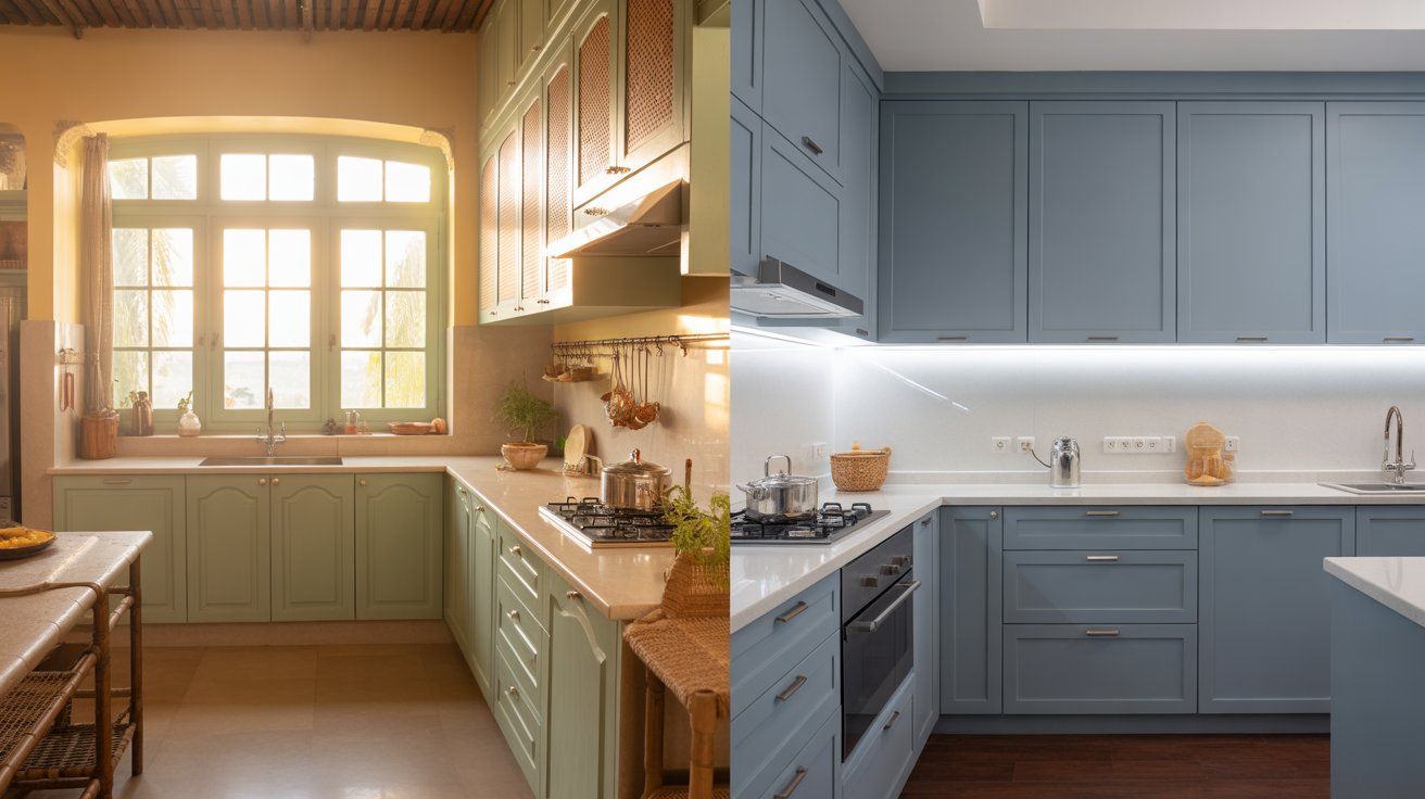
What Colours Pair Well with Orange?

Orange becomes more balanced when paired with calming or grounding tones.
Best Colour Combinations with Orange:
- White and off-white for brightness
- Beige and taupe for warmth
- Grey for modern contrast
- Navy or deep blue for strong balance
- Green and olive tones for an earthy feel
These combinations help tone down orange’s intensity.
Where Does Orange Work Best in the Home?
Orange suits rooms where energy and interaction are welcome.
Living Rooms

Use orange as an accent to create warmth and conversation-friendly spaces.
Dining Areas

Orange enhances appetite and creates a lively dining atmosphere.
Home Offices

Muted orange tones can boost creativity and motivation.
Entryways

A touch of orange creates a welcoming first impression.
Can Orange Be Used in Small Spaces?
Yes, orange can work in small spaces when applied carefully.
Tips for smaller rooms:
- Stick to lighter or muted shades
- Use orange on one wall or in décor elements
- Balance with light walls and reflective surfaces
This keeps the space feeling open rather than crowded.
What Finishes and Textures Soften Orange?
Texture plays an important role in controlling the orange’s intensity.
Best textures to pair with orange include:
- Matte wall finishes
- Natural wood and stone
- Linen, cotton and woven fabrics
- Ceramic or clay décor
These materials help orange feel warm and grounded instead of loud.
Common Mistakes to Avoid When Using Orange
- Painting all walls in bright orange
- Pairing orange with too many bold colours
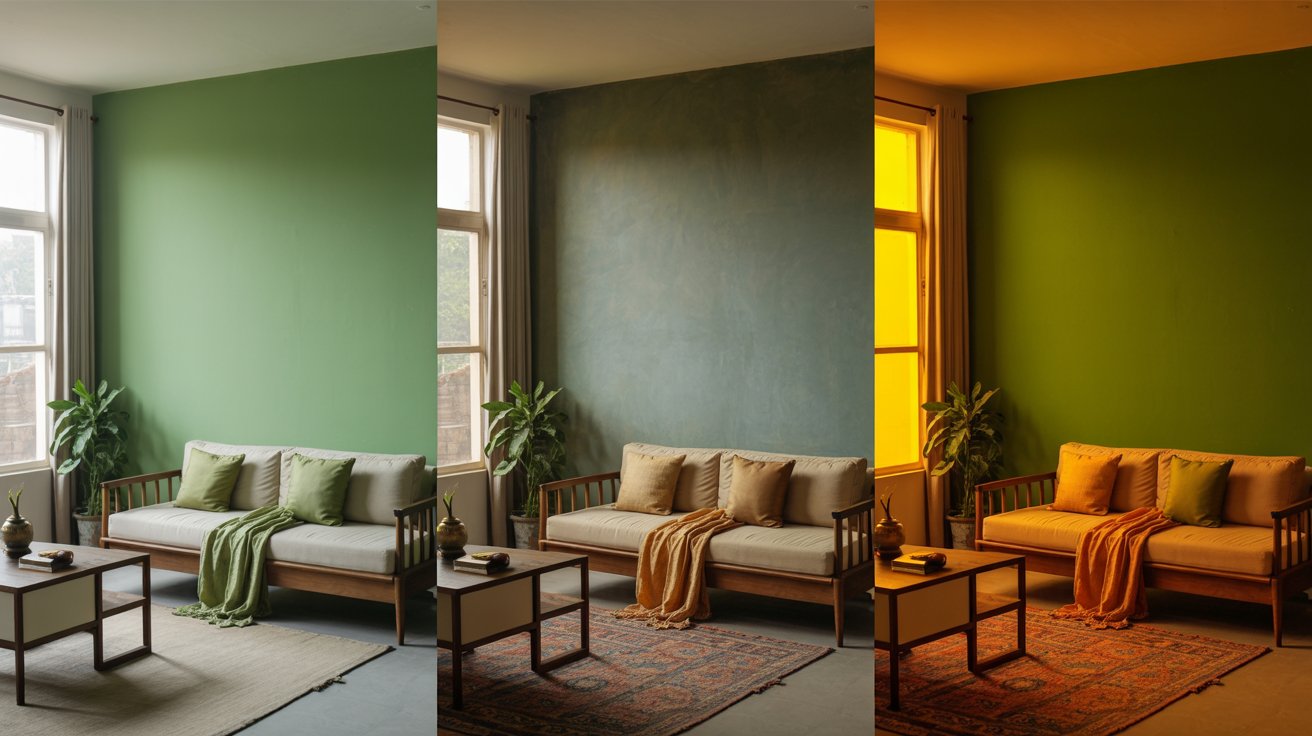
- Ignoring lighting conditions
- Over-accessorising with orange elements
A measured approach ensures balance and comfort.
Key Takeaways: Using Orange Thoughtfully in Interiors
- Orange symbolises energy, warmth and creativity
- Best used as an accent or in muted tones
- Pairs well with neutrals, blues and earthy colours
- Works well in social and active spaces
- Reviewing colour ranges from Indigo Paints can help homeowners compare different orange shades and finishes, making it easier to see how muted and earthy tones behave under various lighting conditions
When used thoughtfully, orange brings personality and warmth to interiors, proving that bold colours can be expressive without being overwhelming.