The Philosophy of Wabi-Sabi: Finding Beauty in Imperfection

In a world that often glorifies perfection, the Japanese philosophy of Wabi-Sabi offers a refreshing perspective, one that finds beauty in imperfection, transience, and simplicity. Wabi-Sabi is deeply rooted in Japanese aesthetics, influencing everything from architecture and pottery to interior design and painting. When it comes to colour, Wabi-Sabi paint colours embrace muted, earthy, and naturally aged tones that evoke a sense of calm and authenticity. This blog explores the essence of Wabi-Sabi colours and how you can incorporate them into your home with paint for truly Zen-inspired home decor.
The Essence of Wabi-Sabi Paint colours: A Timeless Palette
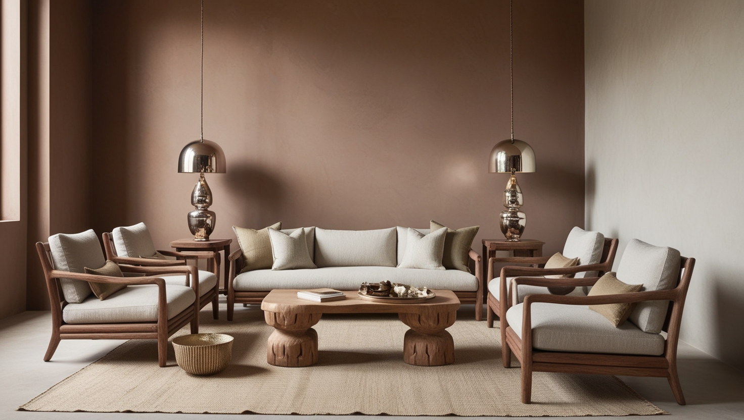
Wabi-sabi colours are derived from nature, reflecting the passage of time and the organic beauty of wear and age. These hues are typically soft, desaturated, and earthy, mirroring materials such as weathered wood, aged stone, and dried leaves. They do not strive for perfection but rather embrace the beauty of irregularity and simplicity.
Some key Wabi-Sabi paint colours include:
- Sabi-Iro (Rust colour): A deep, earthy brown with reddish undertones, reminiscent of aged iron and oxidised copper.
- Kiri-Iro (Fog colour): A soft, muted grey inspired by the morning mist, exuding tranquillity and subtlety.
- Moss Green: A natural, subdued green, mirroring the hues of moss-covered stones and aged gardens.
- Warm Ochre: An earthy, golden tone reminiscent of clay and aged plaster walls.
- Indigo Blue: A deep, slightly faded blue inspired by traditional Japanese textiles and indigo-dyed fabrics.
- Ashen White: A gentle, off-white with warm, organic undertones, symbolising simplicity and purity.
How to Use Wabi-Sabi Paint colours in Your Home
1. Walls with Character
Opt for natural, earthy tones on your walls to create a sense of timelessness and warmth. Subtle variations in shades and textures, such as limewash or matte finishes, can add depth and authenticity to the space. Aged white, soft greys, and muted greens are ideal for achieving a Wabi-Sabi interior design.
2. Weathered and Textured Finishes
Instead of sleek, uniform paint finishes, consider using techniques that mimic natural ageing and texture. Limewash, Venetian plaster, and hand-applied finishes enhance the imperfect beauty of a space, allowing subtle variations to shine through. These finishes also work well in Japanese-style home decor, where depth and character are prized.
3. Natural Accents and Complementary Elements
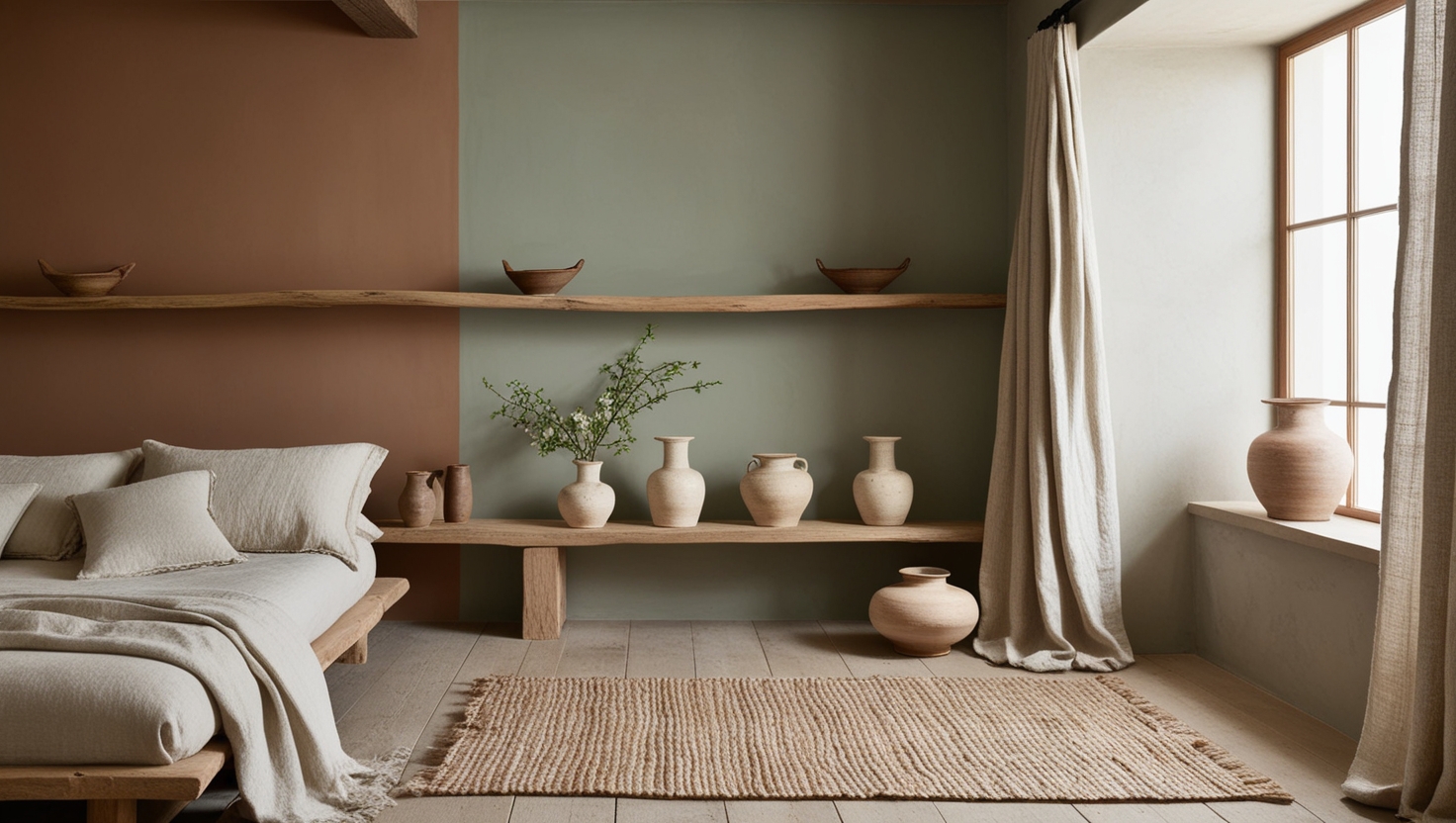
Pair Wabi-Sabi paint colours with organic materials like wood, stone, and linen. Darker, earthy hues such as rust and moss green work beautifully with wooden furniture, while foggy greys and ochres complement stone and clay textures. This is a key aspect of Japanese-style home decor, which prioritises harmony between colours and materials. Incorporate elements such as bamboo blinds, ceramic pottery, and handwoven fabrics to accentuate the aesthetic further.
4. Aging Gracefully with Patina
Embrace patina and natural ageing rather than hiding it. As paint fades or wears over time, it adds to the authenticity of the space. Soft distressing techniques can also be used to create a lived-in, cosy feel. A Zen-inspired home decor approach embraces these changes, reflecting the philosophy that nothing stays the same and that beauty lies in impermanence.
5. Creating a Serene Ambiance
Incorporating Wabi-Sabi paint colours into your home can help cultivate a peaceful and mindful atmosphere. Use these colours in meditation areas, bedrooms, or reading nooks to encourage relaxation. Soft lighting, uncluttered spaces, and minimalist furniture further enhance the tranquillity of the setting, making it the perfect retreat from modern life’s fast pace.
Why Choose Wabi-Sabi Colours?
- Creates a Calming Atmosphere: Muted, earthy tones bring a sense of peace and relaxation, making them ideal for bedrooms, living spaces, and meditation areas.
- Encourages Simplicity and Mindfulness: A Wabi-Sabi-inspired colour palette reduces visual clutter and promotes a serene, mindful living environment.
- Harmonises with Nature: These colours connect your home to the natural world, making the space feel more organic and balanced.
- Enhances the Authenticity of Your Space: By embracing imperfect finishes, natural textures, and soft, timeworn hues, your home will reflect the essence of Wabi-Sabi interior design.
Embracing Wabi-Sabi: A Journey Towards Tranquil Living
Wabi-Sabi is more than just an aesthetic—it is a philosophy that embraces imperfection, simplicity, and the beauty of nature. By incorporating Wabi-Sabi colours into your home, you can create a space that feels authentic, warm, and timeless. Whether through subtle wall finishes, weathered hues, or natural textures, this approach to colour allows you to embrace the beauty of imperfection with every brushstroke.
Are you ready to bring Wabi-Sabi into your home? Choose a palette inspired by nature and let your walls tell a story of timeless beauty and organic charm. If you’re looking for more inspiration, explore this curated wall paint colour combination guide to find the perfect blend of colours that reflect harmony, peace, and understated beauty in your Zen-inspired decor.