When used thoughtfully, red can completely transform the character of a room, from adding warmth and intimacy to creating an energetic focal point. But creating the perfect red wall isn’t just about picking a shade; it’s about understanding red’s psychology, choosing where it works best, and coordinating it with thoughtful colour pairings.
This guide covers all that, plus a simple and practical explanation of how to make the red colour, inspired by basic colour theory.
Why Red Hits Different: The Emotion and Energy Behind This Powerful Colour
Red is one of the most emotionally charged colours in the spectrum. It’s bold, evocative and full of personality. But before painting a wall in this hue, it’s worth understanding why red affects us so powerfully and how you can use that effect to your advantage.
1. Let’s Talk Psychology: What Red Really Does to a Space
Red instantly draws attention. It stimulates the senses, sparks warmth and adds a sense of liveliness. In certain contexts, red can make a space feel more intimate and cocoon-like. In brighter rooms or large spaces, it injects vibrancy without feeling overwhelming when balanced well.
Because of its intensity:
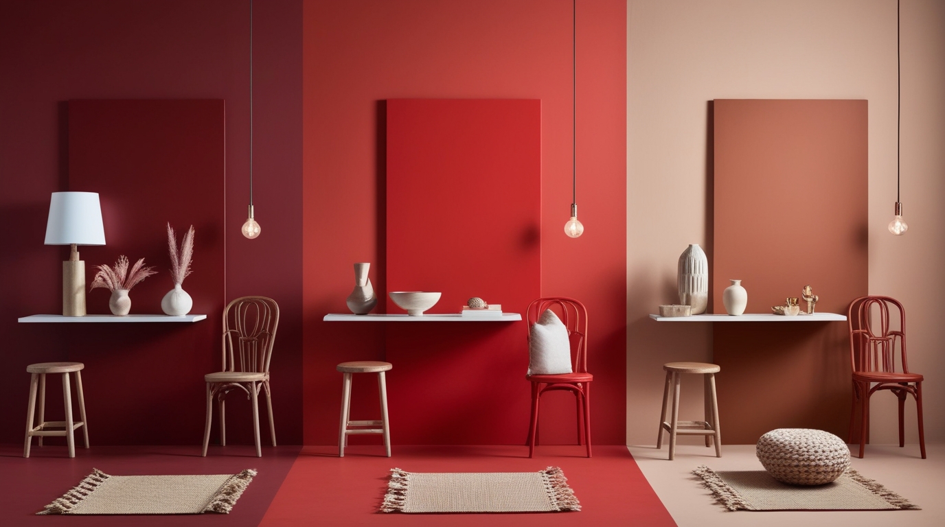
- Deep red shades such as Delectable(1-1-7) from Indigo fandeck feel luxurious and dramatic.
- Bright reds feel youthful, energetic and modern.
- Muted brick or terracotta reds feel grounded, earthy and comforting.
Using red intentionally helps you shape the mood of a room, whether you want a bold backdrop or a subtle statement wall.
2. The Colour Theory Bit: How Do You Make Red?
A common question and one that people search for often, is how to make the red colour or how to make red from scratch. In traditional colour theory, red is one of the three primary colours, which means:
- You cannot create red by mixing two other pure colours.
- You can, however, adjust the character of red by blending it with other tones.
Here’s how to approach it:
- To deepen red: Add a small amount of blue or black.
- To warm red: Add a touch of yellow to create scarlet or vermilion.
- To mute red: Mix in grey or a complementary green (in very tiny amounts).
So while you can’t technically make the base version of red, you can absolutely create customised reds by modifying its temperature, intensity and depth. This is useful for homeowners curious about how to make red colour richer or softer, depending on their design vision.
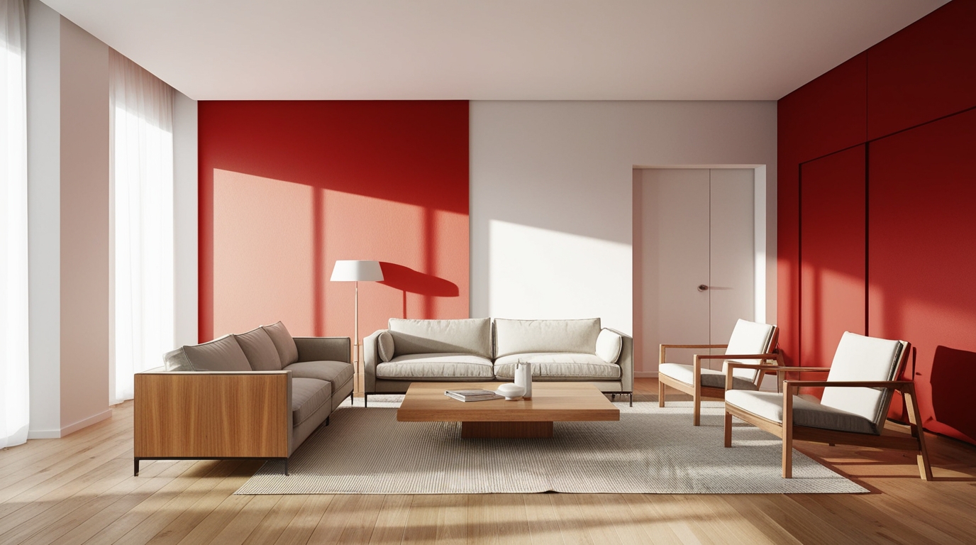
3. Choosing the Right Room: Where Bold Red Walls Work Best
Red is not a one-size-fits-all shade. It shines in certain spaces more than others, depending on natural lighting, room size and purpose.
Best Rooms for a Red Feature Wall
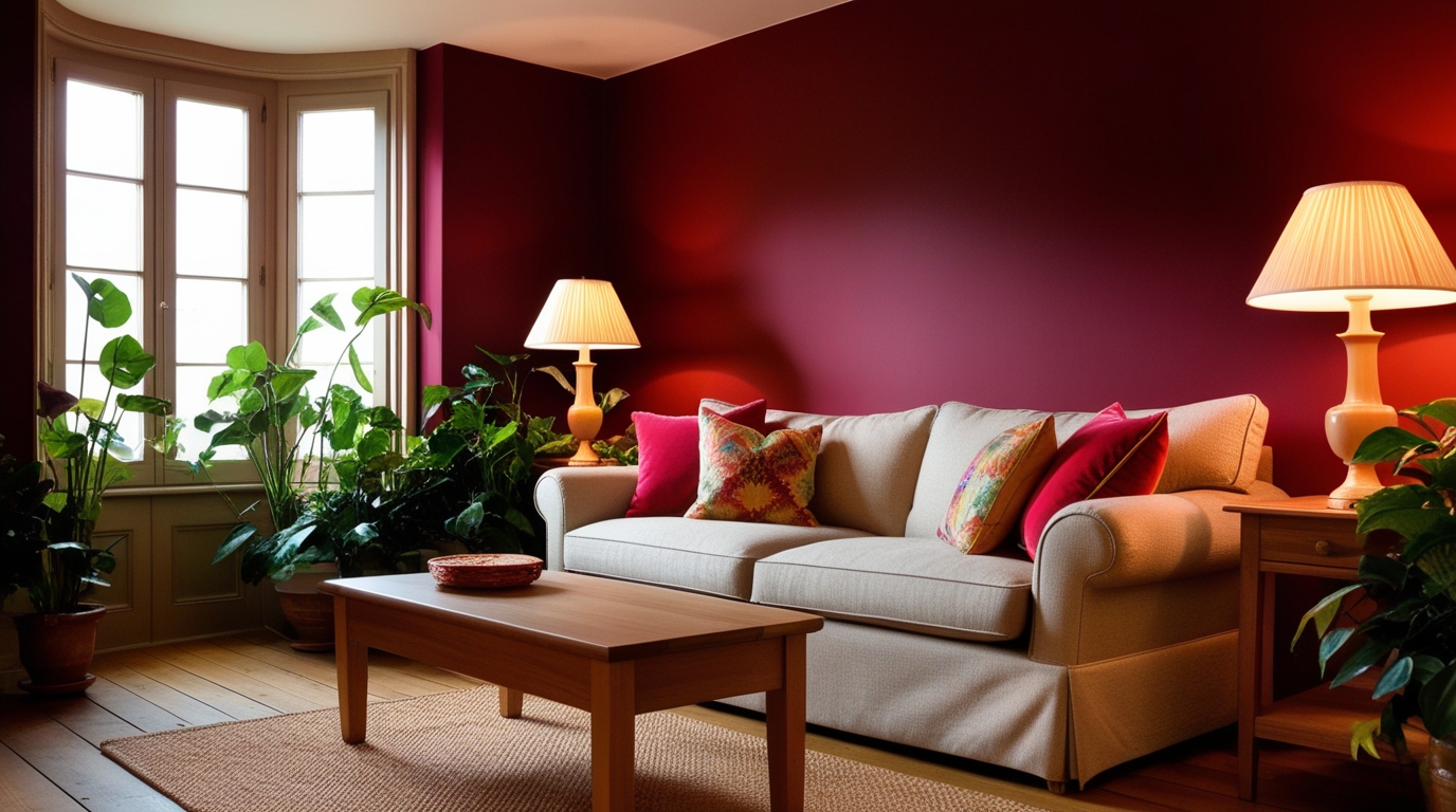
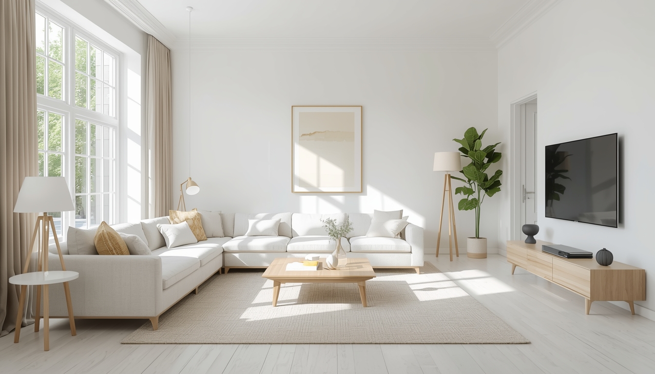
- Living Room: If you prefer cosy conversation zones, a deep red wall behind the sofa can ground the space and invite warmth.

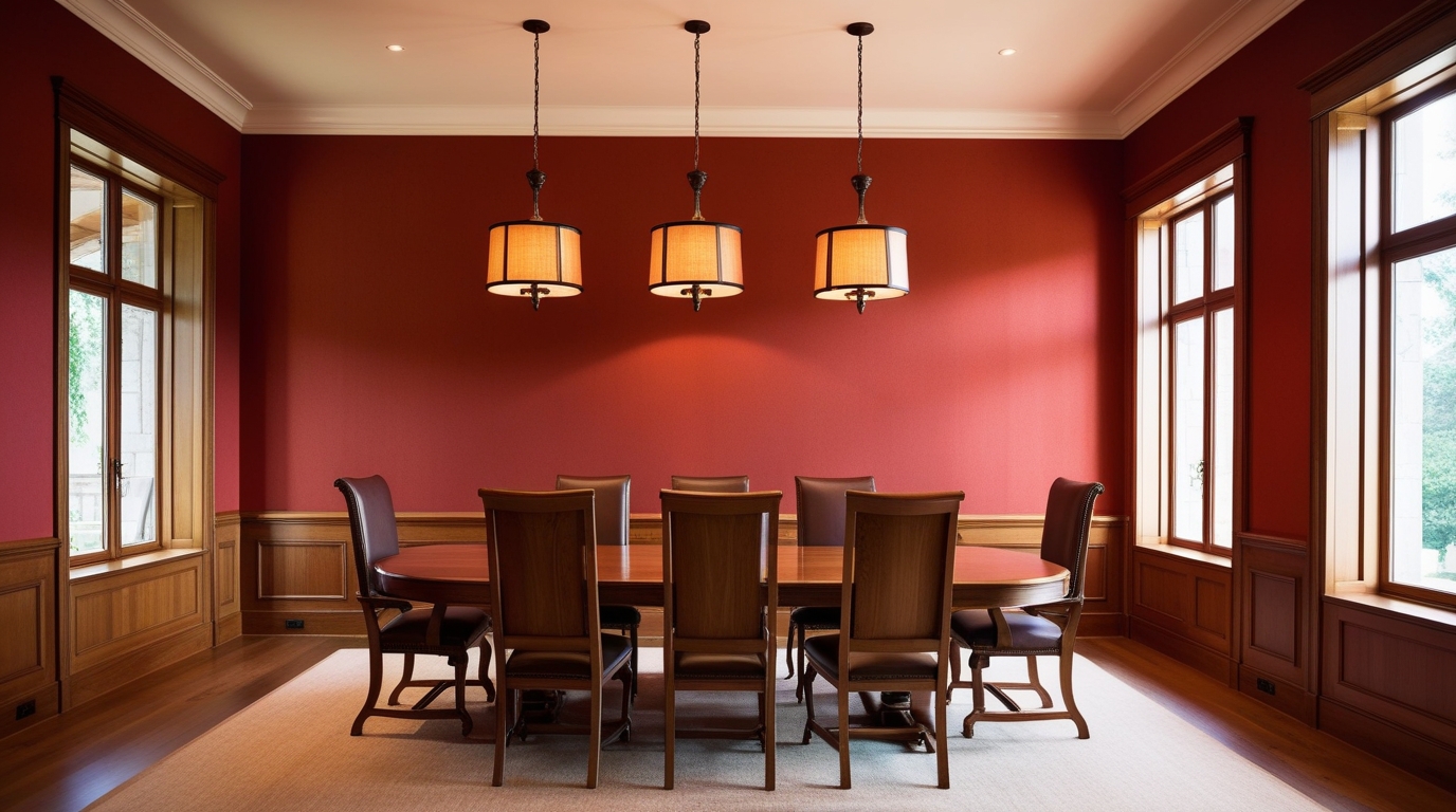
- Dining Room: Red is known to stimulate appetite and energy — perfect for lively meal gatherings.

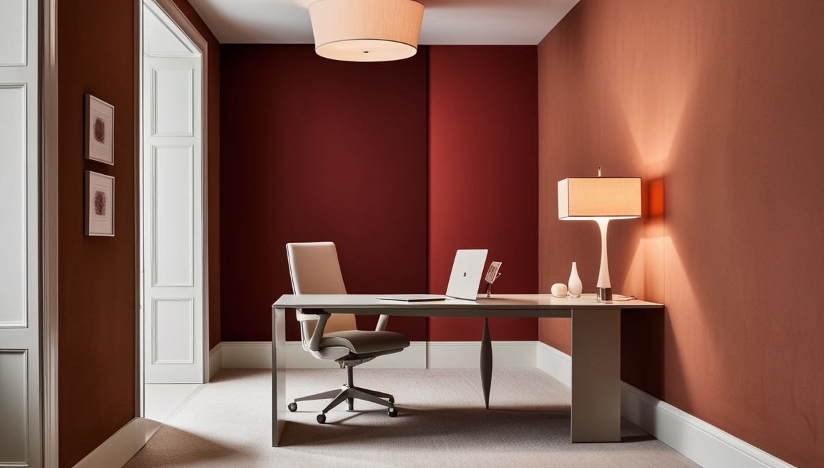
- Home Office: A muted berry or terracotta red adds focus without feeling distracting.
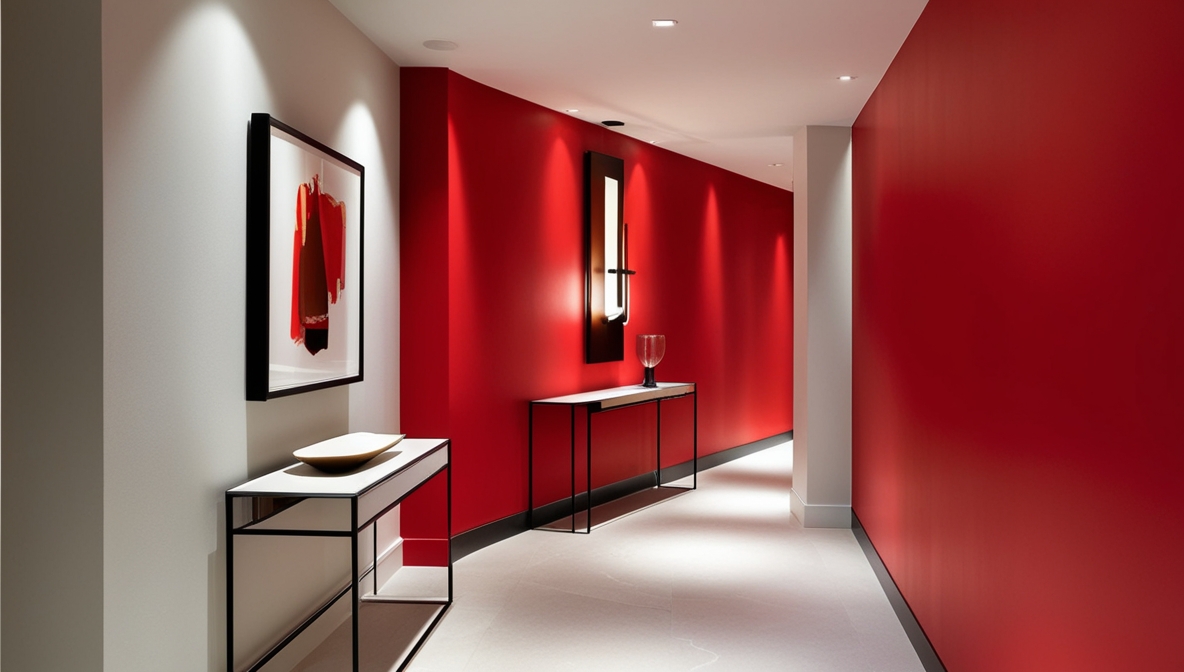
- Hallways & Passages: Narrow spaces come alive with accent colours, and red adds a memorable first impression.
Rooms Where Red Needs Careful Handling
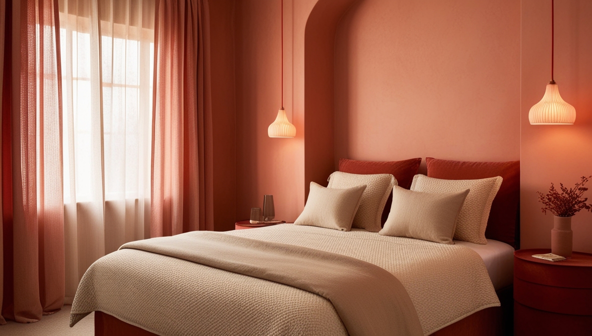
- Bedrooms: Softer reds like clay, blush or muted wine tones work better than strong primary reds.
- Small, poorly lit rooms: Deep red can make them feel smaller unless balanced with light-coloured trims or ceilings.
4. Smart Placement: When a Bold Red Wall Isn’t the Entire Room
Red doesn’t need to dominate all four walls to create impact. Sometimes, strategic placement does the job beautifully.
Consider:
- A single statement wall behind key furniture
- Red alcoves for architectural drama
- Painted door arches or trims for a modern twist
- Half-height colour blocking (red below, neutral above)
- Panelling in muted red for warmth with structure
This approach helps maintain balance, especially in compact spaces.
5. Colour Coordination 101: Shades That Pair Beautifully With Red
Pairing red with the right colours ensures the room feels bold yet harmonious.
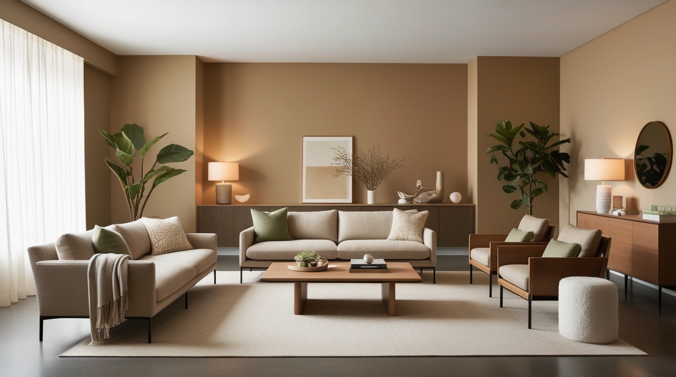
5.1 Neutrals That Tone Down Red
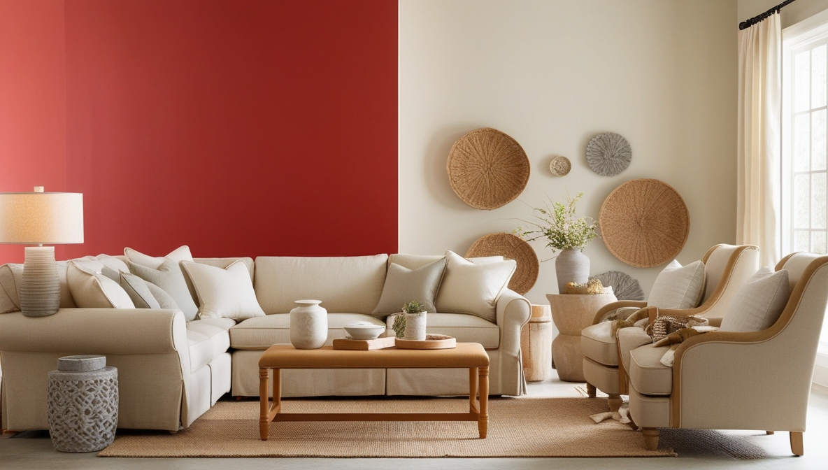
- Warm whites soften the intensity of red without making the space feel stark.
- Beige, tan and cream create a timeless pairing that feels relaxed and elegant.
- Stone grey or charcoal adds modernity and grounds the vibrancy of red.
5.2 Complementary Shades for High Contrast
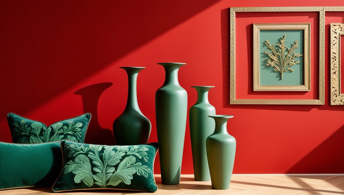
- Forest green, olive or sage complement red naturally since they sit opposite on the colour wheel.
- Use sparingly for accents like cushions, vases or trims.
5.3 Wood Tones That Work
- Light oak balances bright reds.
- Walnut and mahogany pair beautifully with deep reds for a rich, classic look.
5.4 Metallics for a Luxurious Edge

- Gold enhances warmth.
- Brushed brass feels contemporary.
- Black metal adds an industrial-chic vibe.
6. Lighting Matters: How Red Behaves Under Daylight and Artificial Light
Red shifts dramatically depending on the light source:
- Natural light: Red appears brighter and more open during the daytime.
- Warm artificial light: Enhances red’s richness and cosiness.
- Cool LED light: Can make red look slightly sharper or more vibrant.
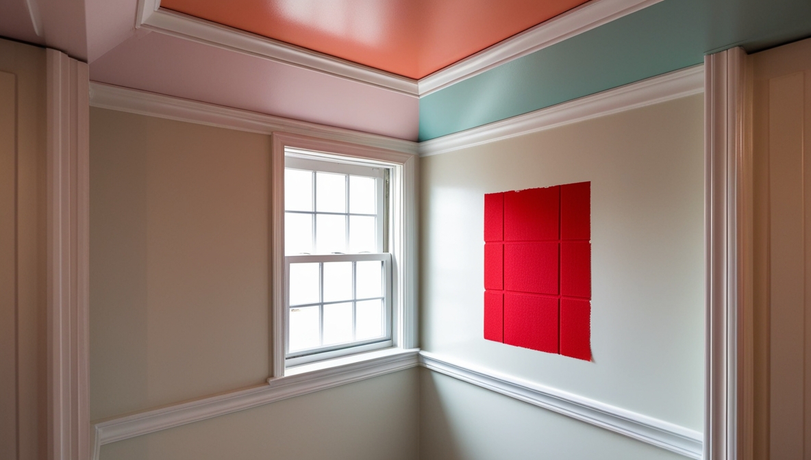
Before finalising, always test a swatch at different times of the day.
7. Finishes That Elevate Red Walls
Your choice of finish determines how the final colour reads.
- Matte Finish: Best for deep, sophisticated reds with minimal reflection.
- Satin or Eggshell: Adds a gentle sheen, ideal for families or high-traffic areas.
- High Gloss: Dramatic, reflective and statement-making — but best used on small surfaces like trims or doors.
8. Practical Styling Tips to Bring a Red Wall to Life
Red walls look their best when styled thoughtfully:
- Add light-coloured furniture to create balance.
- Use textural accents like jute, linen or rattan to soften intensity.
- Include black silhouettes (frames or lamps) to anchor the space.
- Incorporate plants; green tones offer a natural contrast and calm.
A Thoughtful Way to Finish Your Red Wall Journey
Choosing red for your walls is bold, expressive and incredibly rewarding when done right. From understanding how to make a colour red behave differently through mixing, to choosing the perfect room, coordinating tones and styling the space with care, every step helps you create a wall that feels intentional, personal and beautifully balanced.
Whether you lean towards a deep wine, a bright scarlet or a soft terracotta, a well-planned red wall has the power to transform an ordinary room into an unforgettable space.
If you’re ready to bring your red wall vision to life, you’ll find a wide range of beautifully formulated shades with Indigo Paints, helping you achieve the perfect balance of richness, depth and style for your home.