Blue has long held a special place in interiors because it offers a rare blend of calmness, clarity and refreshing energy. Whether seen in the sky, the sea or inside a home, it instantly shapes the mood of a space. Its significance in décor goes beyond colour preference — it influences how a room feels, how spacious it appears and how comfortable it becomes.
This guide explores what blue represents, how it impacts interiors, where to use it, and which colours pair well with it, all framed with helpful, user-friendly insights for homeowners looking for practical painting ideas.
The Meaning of Blue: What the Colour Represents
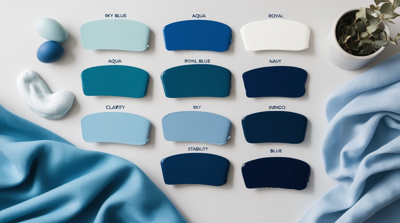
The colour meaning of blue has been studied across cultures and design principles. Overall, it symbolises peace, stability, clarity and spaciousness. But each shade brings its own personality.
1. Sky Blue – Calm and Soothing
A gentle, airy shade that creates a relaxed atmosphere. Ideal for bedrooms or quiet reading nooks where you want a light, peaceful setting.
2. Aqua and Turquoise – Refreshing and Uplifting
Vibrant and energetic, these tones work well in kitchens, bathrooms or any space that benefits from a revitalising touch.
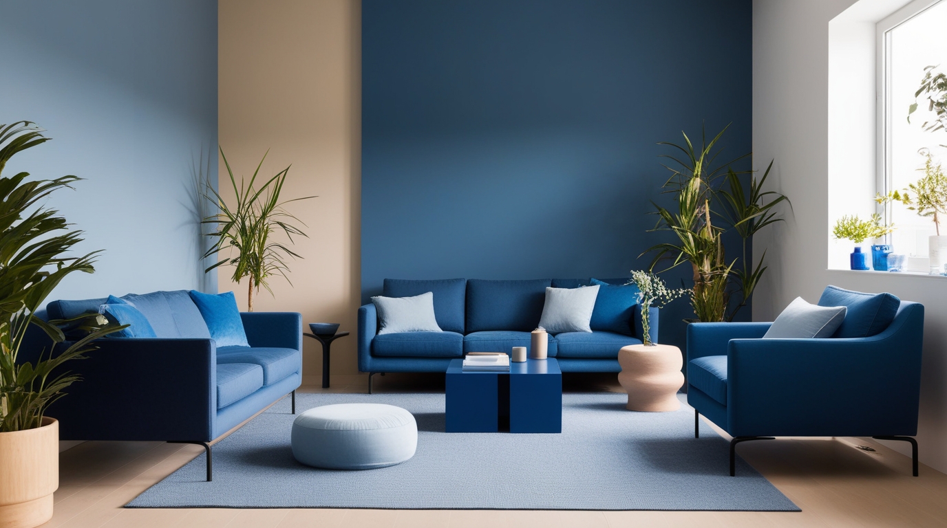
3. Royal Blue – Bold and Contemporary
A striking shade that adds confidence and sophistication. Works beautifully in modern interiors or as a standout feature wall.
4. Navy and Indigo – Deep and Elegant
Rich, timeless tones that add depth and luxury. Perfect for living rooms, dining spaces or accent walls that need a refined look.
How Blue Affects Mood and Atmosphere
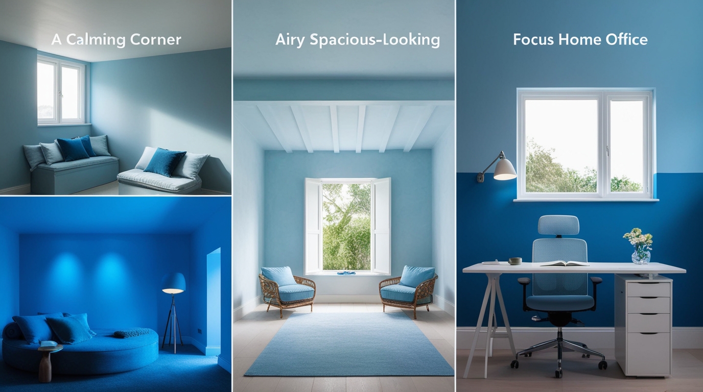
Blue’s psychological influence makes it one of the most effective colours for shaping the feel of an interior.
1. Creates Calmness
Light blues help reduce visual stress and create a restful environment, especially in bedrooms and relaxation zones.
2. Makes Rooms Feel Larger
Because blue visually recedes, it adds a sense of openness, particularly useful in compact homes.
3. Enhances Focus and Mental Clarity
Mid-tone blues such as slate or steel help increase concentration, making them ideal for workspaces.
4. Balances Bright and Warm Spaces
In sun-drenched rooms, cooler blue tones help counter strong light and create visual comfort.
5. Adds Modern Sophistication
Darker blues elevate a room with a polished, boutique-like appeal.
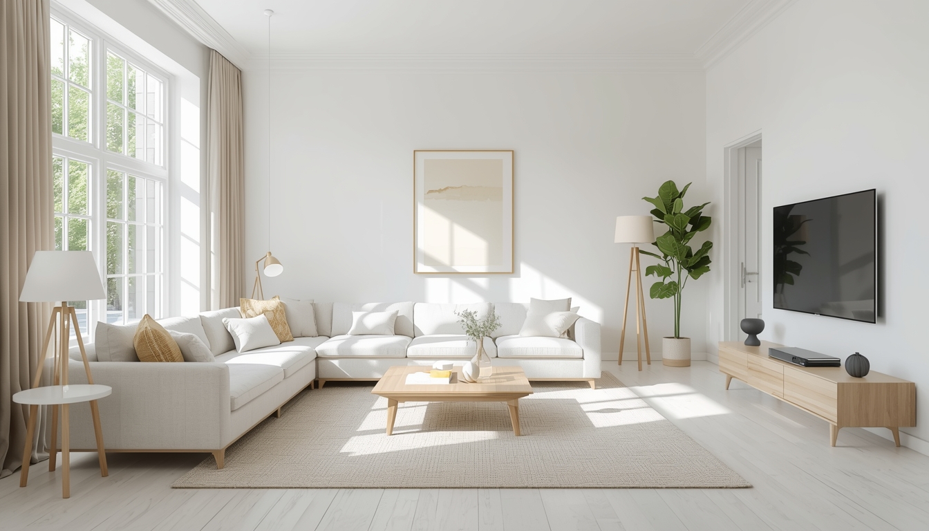
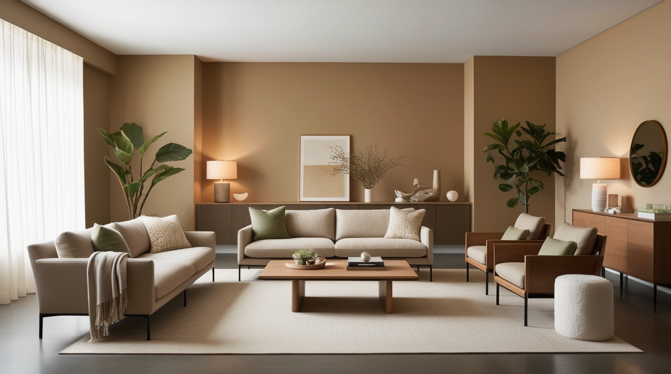
Where to Use Blue Inside Your Home
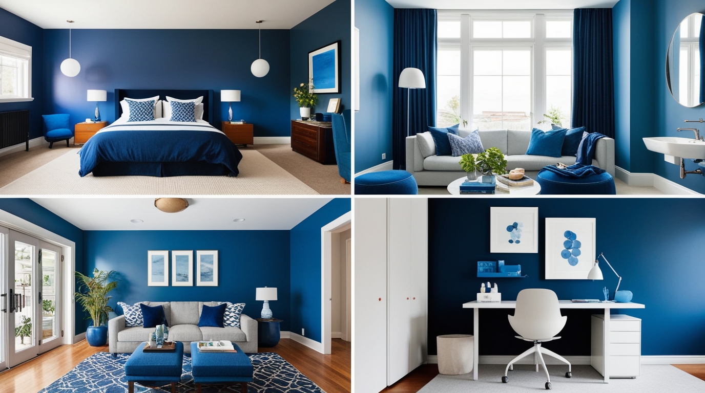
1. Bedrooms
Soothing tones like sky blue, powder blue or blue-grey create a peaceful, restful ambience.
2. Living Rooms
Teal, denim blue or navy add structure and warmth, especially when paired with beige or soft neutrals.
3. Home Office or Study
Shades like slate, steel blue or muted navy support focus and minimise distraction.
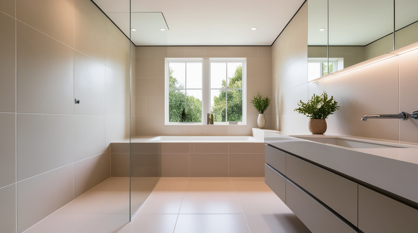
4. Bathrooms
Aqua, turquoise and cool pastel blues reinforce a clean, refreshing, water-inspired feel.
5. Rooms With Little Natural Light
Blue can brighten darker spaces when used thoughtfully.
Best shades:
- Soft aqua
- Light periwinkle
- Dusty blue-grey
Tips to brighten a dark room with paint:
- Choose lighter blue tones
- Use warm LED lighting
- Add mirrors or reflective décor
- Keep upholstery and curtains light
Complementary Colours That Pair Well With Blue
1. Blue + White
Clean, crisp and timeless.
2. Blue + Beige or Sand
Adds warmth and softens cooler tones.
3. Blue + Mustard or Gold
Creates stylish contrast and a modern edge.
4. Blue + Natural Wood
Brings texture, depth and organic balance.
5. Blue + Pink or Coral
A contemporary pairing with a refined, soft contrast.
6. Blue + Green
Works beautifully in nature-inspired or biophilic interiors.
Design Tips for Using Blue Effectively

1. Test Blue in Different Lighting
Blue shifts significantly under natural and artificial light, so always test swatches.
2. Use Warm Lighting for Balance
Warm bulbs (around 2700K–3000K) help prevent blue rooms from feeling too cool.
3. Add Texture for Depth
Materials like wood, cane, stone and woven fabrics enrich blue walls.
4. Avoid Overusing Dark Blue in Small Rooms
Balance deeper tones with lighter trims or furnishings.
5. Start With a Feature Wall
If you’re unsure, begin by painting one wall to experiment with the shade.
Why Homeowners Love Blue: The Practical and Emotional Benefits
Choosing blue is as much about emotion as it is about design. Its associations with calmness, clarity and balance make it versatile across different interior styles. It can make compact rooms appear more spacious, soften bright spaces and bring a sense of order to busy areas.
Whether you prefer delicate sky tones or deep, character-rich navy, blue adapts effortlessly to any room. Combined with the right complementary colours, textures and lighting, it becomes one of the most rewarding choices for modern Indian homes.
To explore a wide range of blue shades suitable for every room and lighting condition, homeowners can look into the curated options available from Indigo Paints, designed to help create interiors that feel both beautiful and thoughtfully balanced.