A practical, user-friendly guide to colours and design ideas that feel fresh, calm, and future-ready.
The New Year isn’t just about resolutions; it’s also the perfect time to reset your surroundings. As we step into 2026, interior trends are shifting toward calm, thoughtful, and long-lasting design choices. Homes are becoming places to slow down, focus, and recharge, and paint colours are leading this transformation.
If you’re planning a refresh, whether it’s a full repaint or a small update, this guide will help you choose colours and ideas that feel modern, uplifting, and easy to live with throughout the year.
What’s Defining New Year Interiors in 2026?
Before we dive into colours, here’s the bigger picture behind 2026 interiors:
- Comfort over clutter – fewer bold experiments, more soothing palettes
- Nature-inspired tones – colours that feel grounded and restorative
- Soft warmth – warm neutrals replacing cold greys
- Flexible spaces – rooms that work for living, working, and relaxing
Think fresh but not flashy, stylish yet practical.
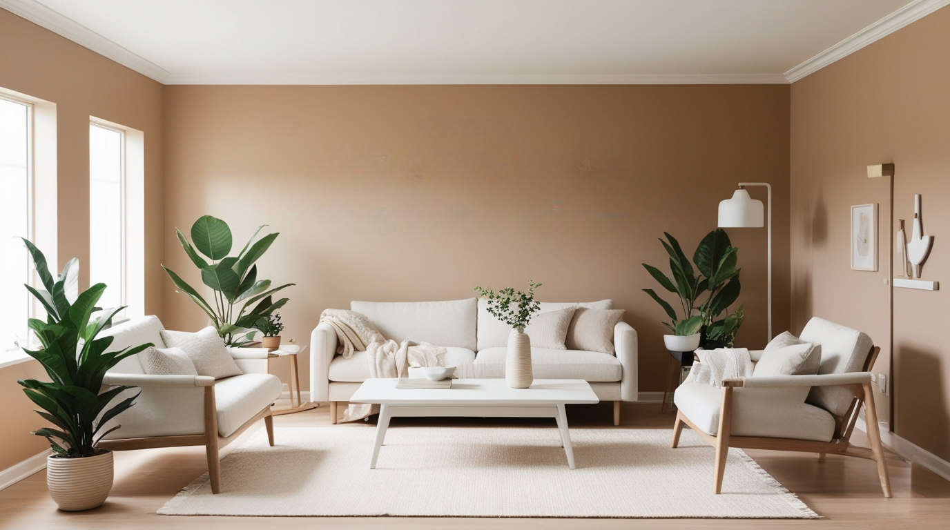
1. Soft Neutrals That Feel Clean, Not Cold
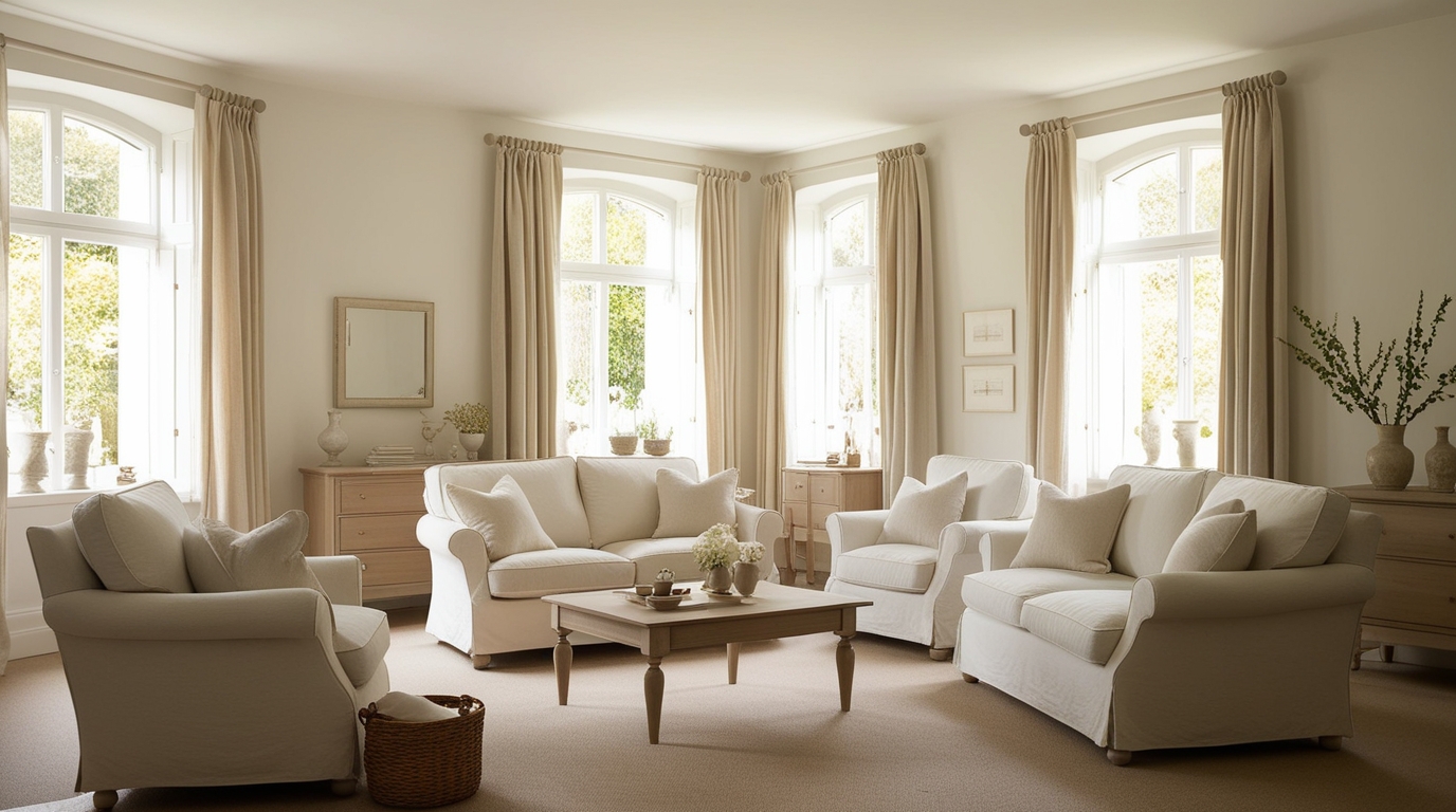
Best for: living rooms, entire homes, open-plan layouts
Trending neutral shades for 2026
- Warm white
- Creamy ivory
- Soft beige
- Greige (grey with warm undertones)
Why they work: These colours instantly make spaces feel brighter and calmer. Unlike stark whites or cool greys, warm neutrals feel welcoming and age well.
Style tip:
Layer neutrals with different textures, such as linen curtains and wooden furniture, to avoid a flat look.
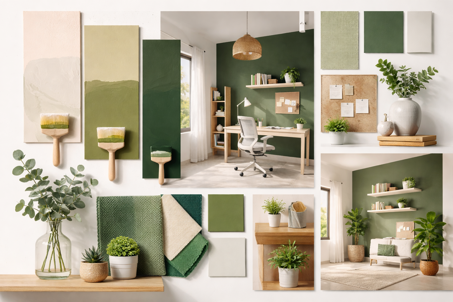
2. Muted Greens for Balance and Well-Being
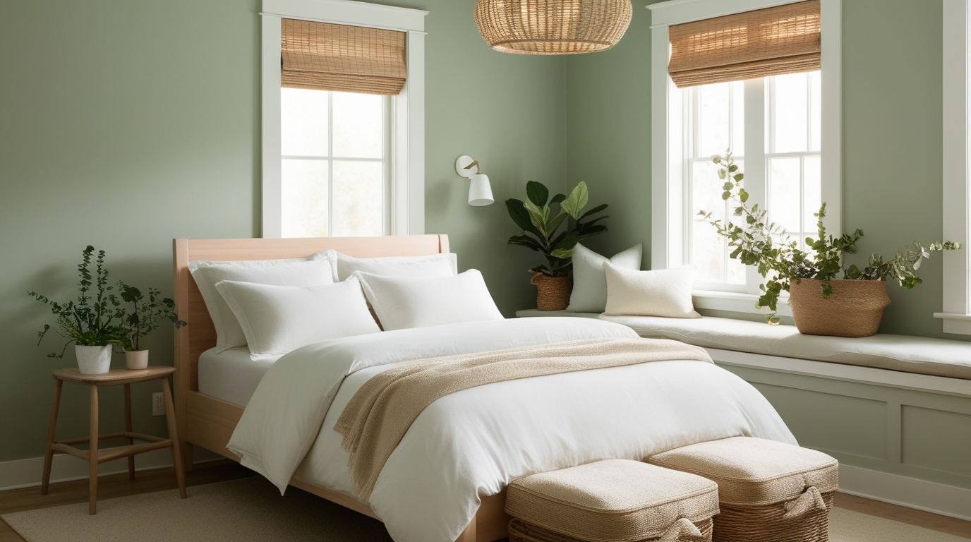
Best for: bedrooms, study rooms, reading nooks
Popular green tones
- Sage green
- Olive
- Moss green
- Soft eucalyptus
Why they’re trending: Green is strongly linked to calmness and mental clarity—perfect for a fresh start in the New Year.
How to use green without darkening the room
- Choose lighter, muted greens for small rooms
- Use green on one wall or behind the bed
- Pair with warm whites, beige, or light wood
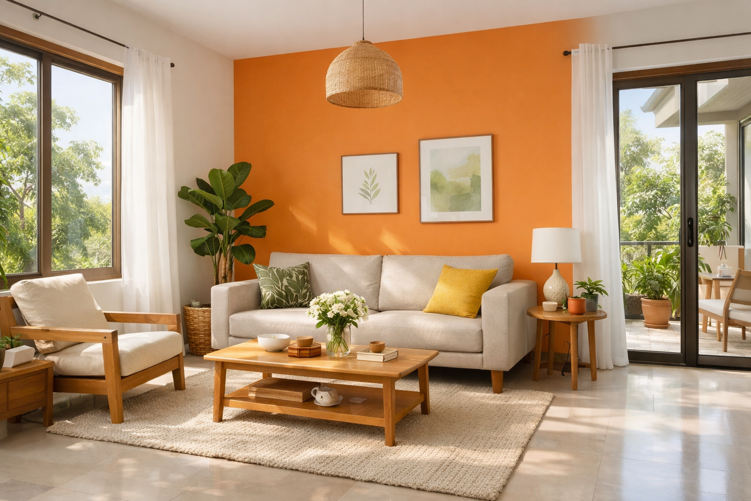
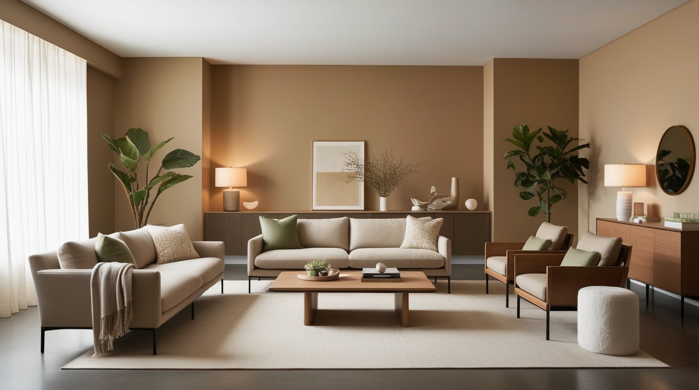
3. Earthy Browns, Clay & Warm Terracotta
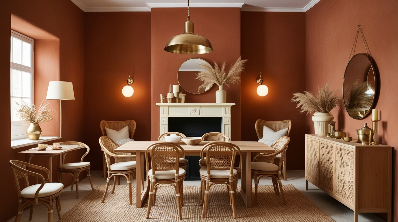
Best for: living rooms, dining areas, cosy corners
Earth tones to watch in 2026
- Clay
- Terracotta
- Cinnamon brown
- Cocoa
Why they work: Earthy shades add warmth and depth without feeling heavy. They also transition beautifully across seasons.
Best pairing ideas
- Cream or off-white ceilings
- Cane, rattan, or wooden furniture
- Soft gold or brass accents
These colours are ideal if you want a groundedand comforting home to start the year.
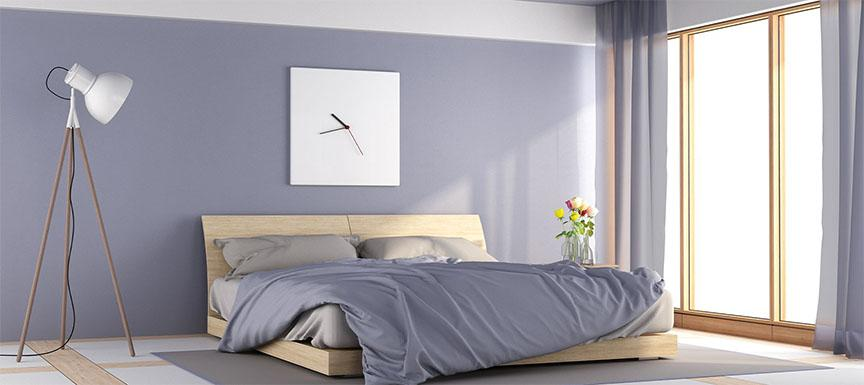
4. Soft Blues & Blue-Greys for a Fresh Reset
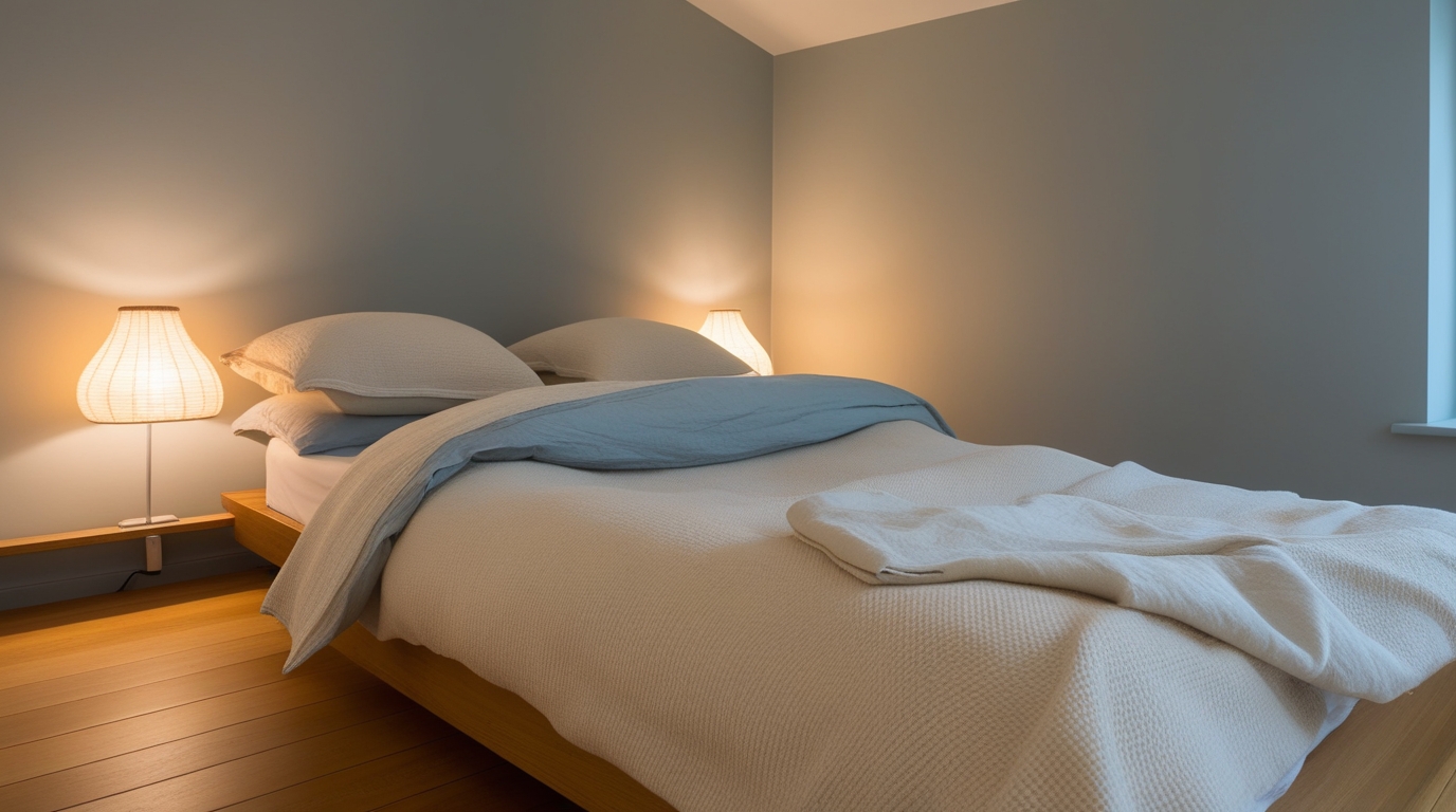
Best for: bedrooms, bathrooms, workspaces
Trending blue tones
- Powder blue
- Blue-grey
- Muted denim
- Misty blue
Why they’re back: Blue in 2026 is less bold and more soothing—designed to reduce visual noise and promote focus.
Design tip:
Balance cool blues with warm elements like wooden floors, beige rugs, or warm lighting.
5. Accent Colours That Add Personality (Without Overdoing It)

Best for: feature walls, entryways, niches
Popular accent shades
- Deep teal
- Charcoal grey
- Muted navy
- Wine or berry tones (used sparingly)
Where accent colours work best
- Behind a sofa or bed
- Entryway walls
- TV units or shelving backdrops
Keep accent colours to one surface per room to maintain a clean, modern look.
Interior Ideas to Refresh Your Space Without a Full Renovation
A New Year refresh doesn’t always mean repainting everything.
Easy upgrades that make a big impact
- Repaint one key wall instead of the entire room
- Update cushion covers, rugs, or curtains to match your new palette
- Switch to warm LED lighting for instant ambience
- Add mirrors to reflect light and make rooms feel larger
These small changes help your home feel “new” without major effort.
Room-by-Room Colour Suggestions for 2026
Living Room
- Warm neutrals or earthy tones
- One subtle accent wall for depth
Bedroom
- Muted greens or soft blues
- Avoid very dark or very bright shades
Dining Area
- Clay, terracotta, or beige
- Works well with warm lighting and wooden furniture
Home Office
- Sage green or blue-grey for focus
- Keep décor minimal to avoid distraction
Common Mistakes to Avoid When Refreshing for the New Year
- Choosing colours based only on trends, not lighting
- Mixing warm and cool undertones without balance
- Using too many bold colours in one space
- Ignoring how colours look at night
Tip: Always test paint shades in both daylight and artificial light.
How to Make Your 2026 Colour Choices Last Longer
To avoid repainting soon:
- Stick to timeless base colours
- Use trendy shades only as accents
- Choose colours that complement your furniture
- Focus on comfort, not just aesthetics
A well-chosen palette should feel good in February and November.
Start 2026 with a Space That Feels Right
Interior trends for 2026 highlight calm, adaptable spaces built around soft neutrals, muted greens, earthy shades, and gentle blues. These colours support a fresh start while remaining practical for everyday living. Focusing on timeless bases with subtle accents helps interiors stay relevant across seasons. Well-considered palettes, including those available from Indigo Paints, allow homeowners to refresh their spaces thoughtfully without frequent redesigns.